

Goodwings — Brand Campaign Activation
Goodwings ran an Anti-Black Friday campaign during peak sales season — a deliberate counter-move against the culture of short-term discounts and performative green gestures that dominate travel marketing at that time of year. The campaign positioned Goodwings’ sustainable aviation fuel offering as the real alternative: not a deal, but a commitment. I worked on the campaign at both strategic and execution level, across outdoor, social, and digital.
Creative Direction
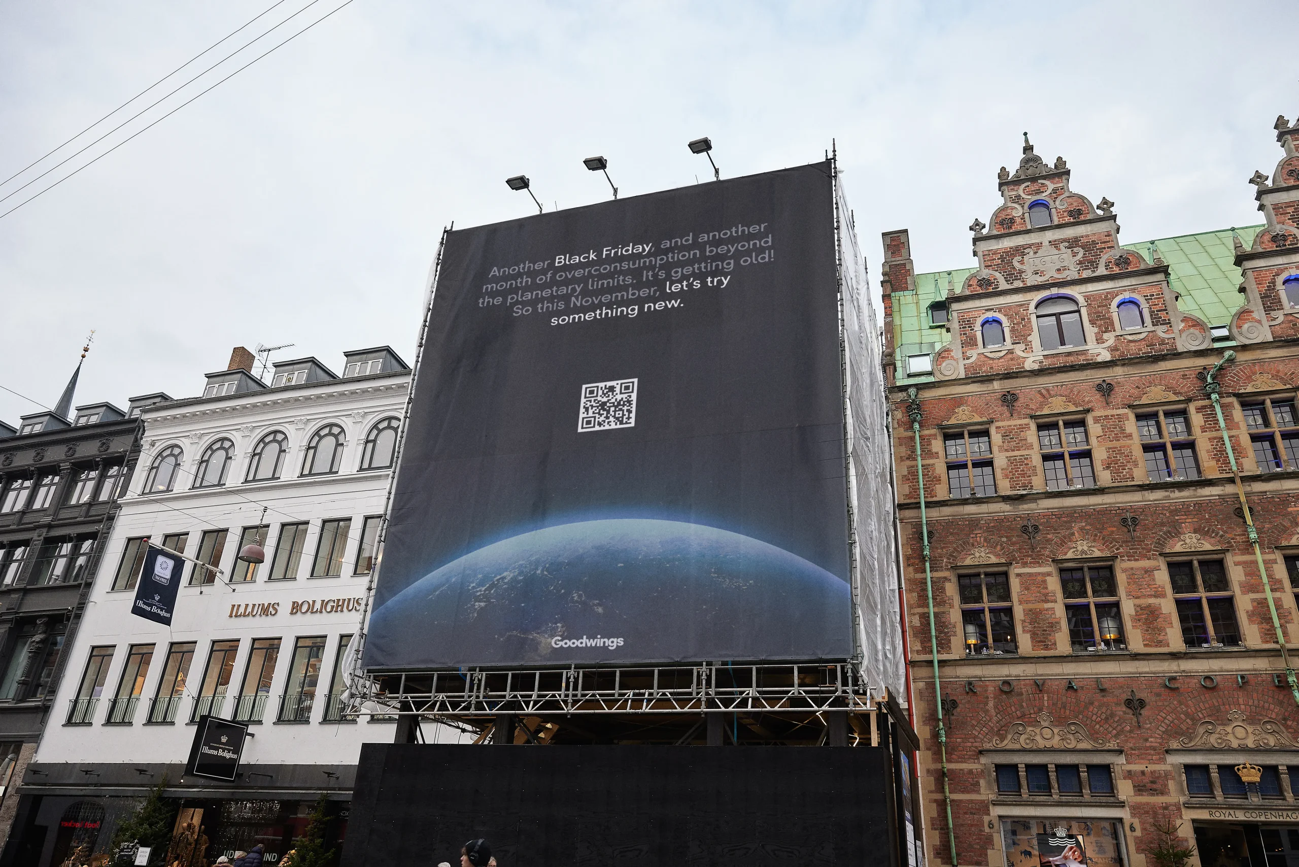
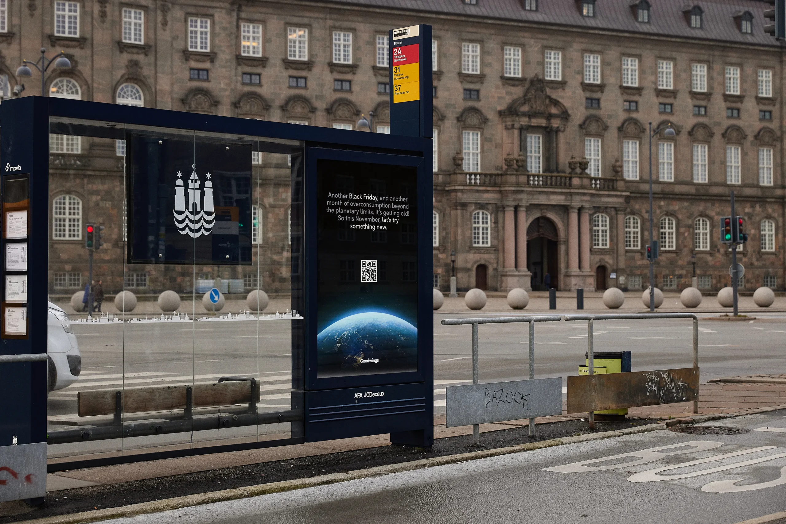
The visual approach was a deliberate break from the Goodwings design system. Black — a colour we didn’t use — became the campaign’s dominant tone, chosen specifically because it reframes what Black Friday means. Bold, heavy typography replaced the brand’s usual restraint. The effect was intentional contrast: while every other brand was shouting discounts in the same visual language, this looked categorically different. Calm, serious, confident.
That restraint was the statement. The campaign didn’t try to compete with Black Friday noise — it opted out of it entirely, which made it more visible, not less.
Outdoor & Print
The campaign ran across large-format outdoor — billboards and bus stop banners in high-traffic locations. The black-dominant visual system translated well to physical scale: bold typography at that size doesn’t need anything else. QR codes on each placement connected passersby directly to the landing page, turning static outdoor into a measurable digital touchpoint.
Landing Page
The landing page was the campaign’s conversion layer — built around driving awareness and starting conversations about Goodwings’ SAF offering. The design carried the campaign visual language through to digital without diluting it, giving people who scanned the QR code a coherent experience from street to screen.
Outcome
The response was strong across all three objectives: brand awareness, brand positioning, and conversion — with meaningful organic traffic coming through QR scanning from the outdoor placements.