

Goodwings — Climate & Emissions Product Design
Goodwings is a B2B travel platform helping companies manage business travel and meet their climate reporting obligations. When I joined, the product was focused primarily on hotel bookings. I became responsible for designing a new generation of the platform — an end-to-end product spanning an online booking tool, a sustainability suite with climate reporting, emissions scope tracking, analytical predictions, CO2 budgets, certificates, and reports.
This case study zooms into one specific feature within that platform: the missing emissions data flow — the system that enables both sides of a compliance problem to connect. Compliance Owners to see where data gaps are and act on them at scale. Travellers to receive a clear, frictionless request and close the loop quickly. It is a focused look at how a single well-designed feature can turn a chronic operational problem into something manageable.
The problem
When business trips were booked outside Goodwings — directly with airlines, hotels, or through other tools — the emissions data for those trips was either missing or incomplete.
For companies with ESG targets, this created real risk. Reporting became unreliable. Gaps compounded. If an audit came, there was no clean way to account for it.
But the data problem had a human problem underneath it.
Compliance Owners could see that gaps existed. The tooling gave them no way to understand the scale, identify who was responsible, or act efficiently. Their only option was manual follow-up — one email at a time.
On the traveller side, requests to fill in missing trip details arrived late, out of context, with no explanation of why it mattered. Most people ignored them. Low completion rates meant the gaps kept growing.
This was not a data problem. It was a behaviour problem with a data consequence.
Research
Research ran across five channels in parallel — direct interviews with Compliance Owners, ongoing collaboration with the customer success team, support ticket review, direct conversations with travellers, and a session with the Head of Sustainability to align on reporting requirements.
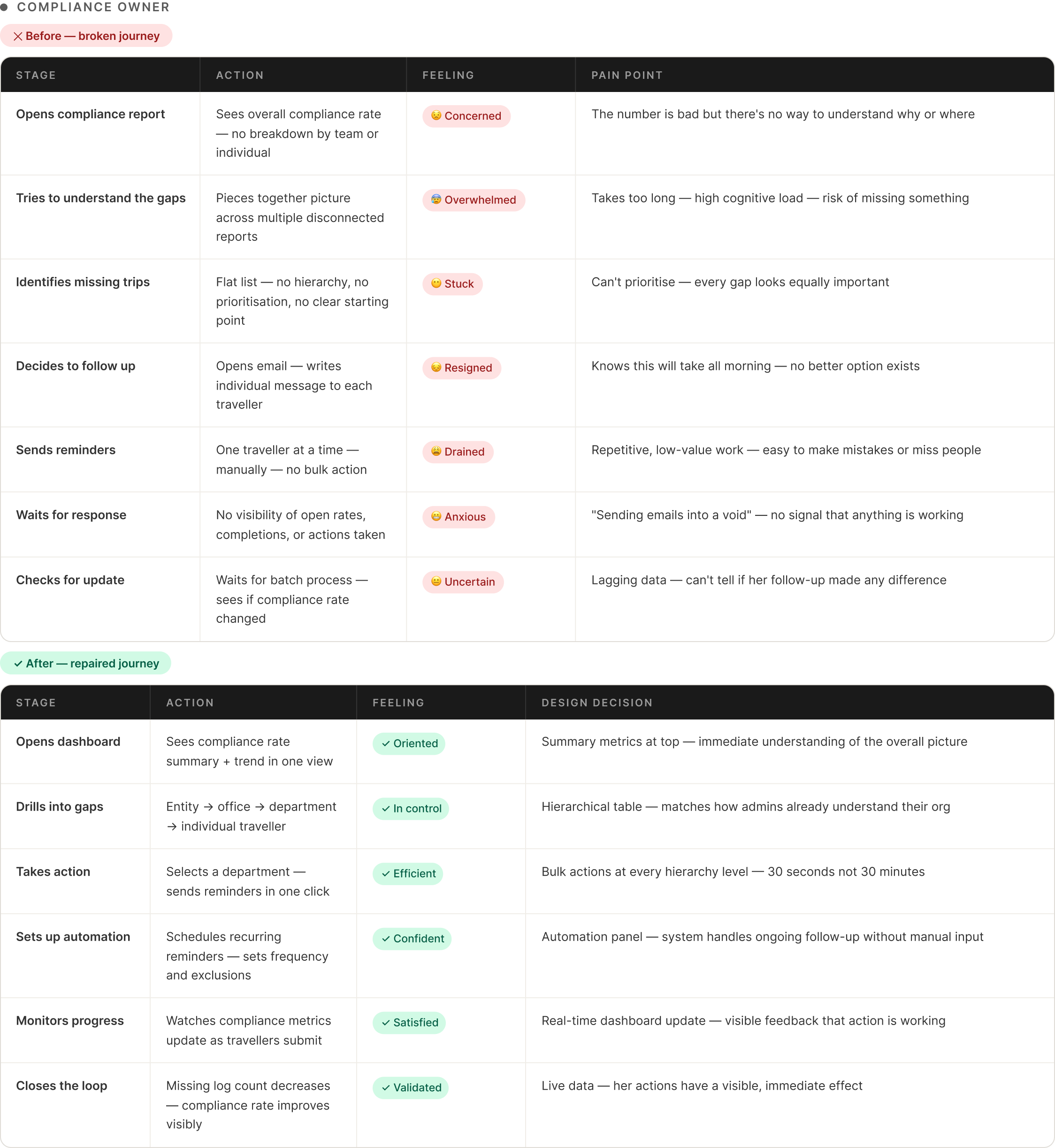
What emerged was consistent across every source. Compliance Owners felt responsible for outcomes they had no real tools to control. Several described their process as sending emails into a void. The most revealing detail: they had started maintaining separate spreadsheets to track who they had emailed, because the platform gave them no way to do it. A workaround so normalised nobody had questioned it.
On the traveller side, the behaviour was not obstructiveness — it was rational. A vague request arriving weeks after a trip, sitting behind a login wall, with no explanation of why it matters, gets ignored. The same people said clearly: make it specific, timely, and frictionless and they would complete it straight away.
What the research pointed toward — but hadn’t yet confirmed structurally — was that the two sides of this problem had never been designed as one system.
Empathy maps
Research was synthesised into two empathy maps — one per user — capturing what each person says, thinks, does, and feels when navigating the current system.

The Compliance Owner’s map revealed a person drowning in effort with no feedback — visible problems, no tools to fix them, and a growing sense that nothing they did was making any difference. The Traveller’s map revealed something different: not apathy but rational avoidance. Cold context, unclear purpose, and one decisive barrier — the login wall — that ended most attempts before they even started.
Pain points
Personas
Two personas anchored all design decisions — one representing the person responsible for fixing the compliance picture, one representing the person who created the gap.
User stories
Thomas: as an ESG Manager responsible for compliance reporting, I want to see exactly where our emissions data gaps are and act on them efficiently — so our data is accurate without manual follow-up consuming my day.
Clara: as a traveller who booked outside the platform, I want to understand simply what is missing and submit it quickly — so I can close the loop without it feeling like a complicated administrative task.
These two stories had to connect. If Thomas sends a reminder that Clara ignores, the system fails. If Clara completes a submission that Thomas cannot see in real time, the loop stays broken. The design had to make both sides of that exchange work.
Defining the scope
With personas and user stories mapped, time was spent with the product manager and engineering lead understanding the full system shape. What trip types created the most gaps? Where in the booking journey was data most likely to go missing? What did Thomas actually need to see before he could act?
That work confirmed what research had pointed toward: the two sides had never been designed as one flow. Thomas sent reminders into a void. Clara received requests without context. Neither could tell when the loop had been closed. Solving one side without the other would fail — a compliance dashboard with no traveller completion path is just a better way to watch the problem grow. A frictionless traveller form with no admin visibility is data arriving with nobody able to act on it.
The brief that came out of this was precise: build a connected system where Compliance Owners can identify gaps at scale and trigger targeted reminders — and where travellers receive a request so clear and frictionless that completing it is the easier option. With real-time visibility on both sides when the loop closes.
Problem statement
Thomas needs a way to identify and close emissions data gaps at scale — because manual follow-up is unsustainable and low traveller completion rates mean ESG data is chronically incomplete and audit-exposed.
Clara needs a way to understand and complete missing trip data quickly — because vague, poorly timed, barrier-heavy requests make doing nothing the rational choice.
Hypothesis
If Compliance Owners are given hierarchical visibility of compliance gaps with immediate bulk action capability, and travellers receive a direct frictionless submission path with no login wall and only missing fields shown — then completion rates will increase, manual follow-up time will decrease, and compliance data will become reliably complete in real time.
Ideation
For Thomas, the central question was: what is the right level of abstraction for someone managing compliance across hundreds of people? Several directions were explored — flat filtered lists, summary dashboards with export, alert-driven workflows. The hierarchical drilldown emerged as the right answer because it matched how Compliance Owners already understood their organisations: top-down by entity, office, department, individual. Action capability at every level meant the tool worked whether Thomas was dealing with one person or five hundred.
For Clara, ideation was almost entirely subtractive. Every option was tested against one question: does this give someone a reason to stop? The login wall had to go — it asked for effort before Clara had even seen what the task was. The full form became only missing fields — showing a complete form when two fields were incomplete made the task feel three times larger than it was. An ESG explanation was drafted and removed after testing showed it increased drop-off rather than motivation. Context that feels meaningful to a designer feels like extra reading to someone who just wants to finish and move on.
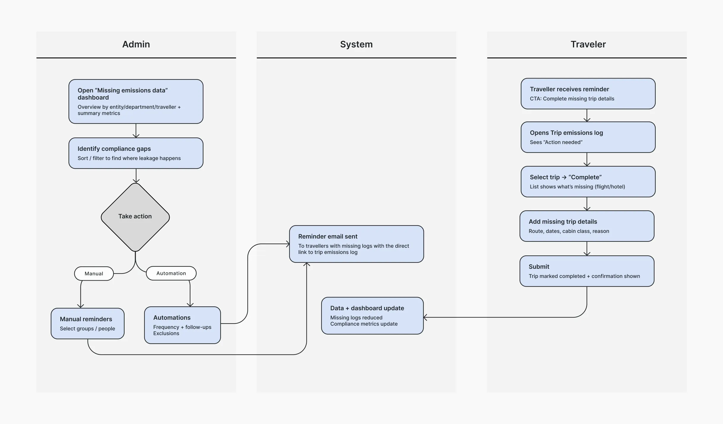
The structural decision that tied both sides together — reminder sent from Thomas’s action, real-time dashboard update on Clara’s completion — was what made this a system rather than two separate tools running in parallel.
Design principles
With the structure defined, two principles governed every screen that followed — one per user.
For Thomas: clarity at the right level of abstraction. Enough to understand the problem and act — not so much it becomes a data analysis task. Every screen should answer one question: what is the problem, and what do I do about it?
For Clara: ruthless reduction. Only what is missing. Plain language. One path to submit. No ESG explanations. No dashboard. No unnecessary steps.
These principles were in useful tension — depth and hierarchy for one user, simplicity and speed for the other. The challenge was making them feel like parts of the same system despite serving completely opposite needs.
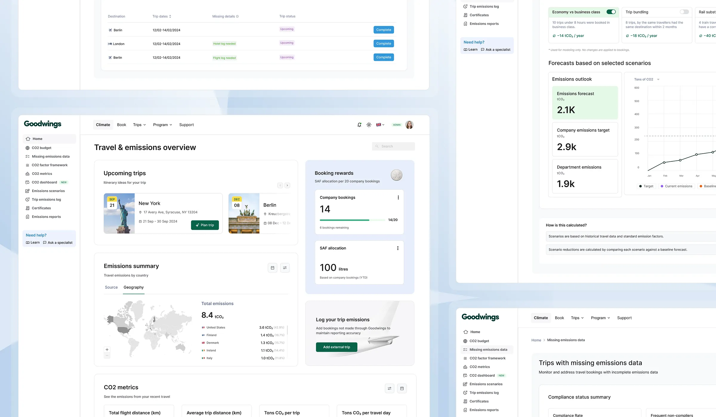
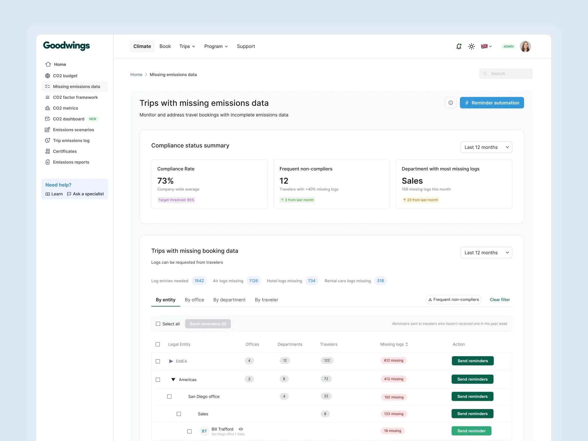
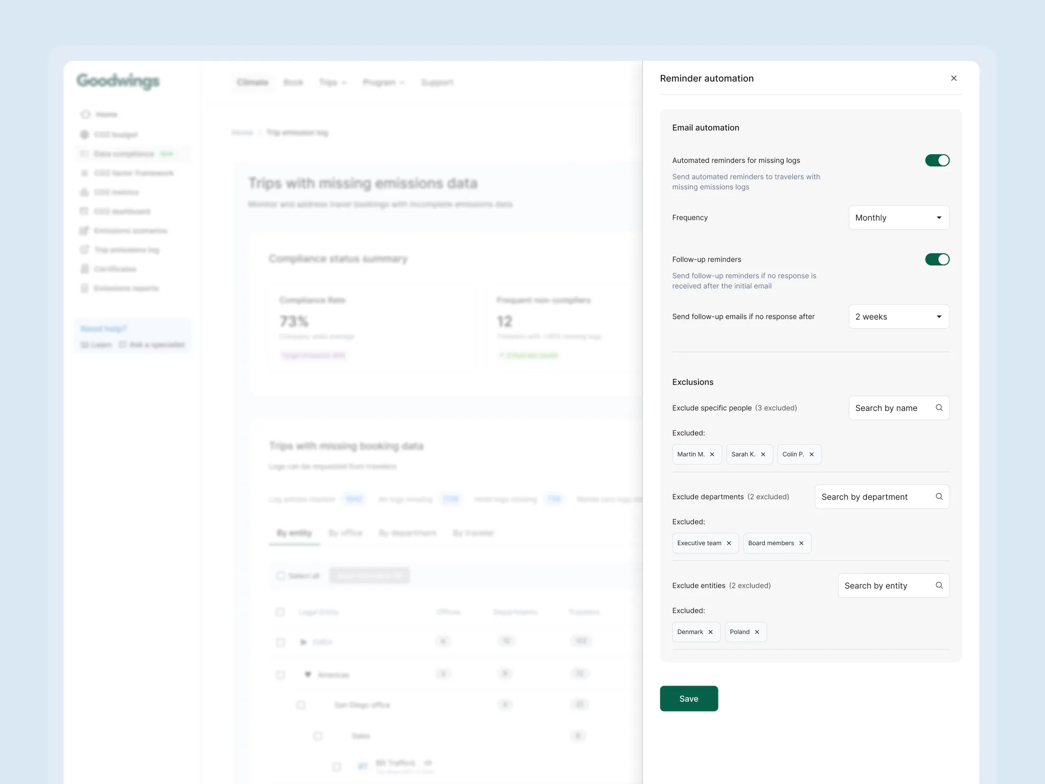
The admin side — compliance at scale
The core design decision was a hierarchical view. Summary metrics at the top — compliance rate and trend. Then a drillable breakdown by entity, office, department, and individual traveller. Each level showed the missing log count with a direct action — send a reminder — without navigating away. The hierarchy matched how Thomas already thought about his organisation, making the tool legible immediately without training.
Bulk actions were non-negotiable. Selecting an entire department and sending reminders in one click was the difference between a tool that helped and one that added more burden than it removed. An early version required individual selection — feedback from customer success made clear that would never scale.
Automated reminders with frequency and exclusion controls solved a specific frustration from research: Compliance Owners who had tried to manage this manually had given up — not because they stopped caring, but because there was no sustainable way to keep going.
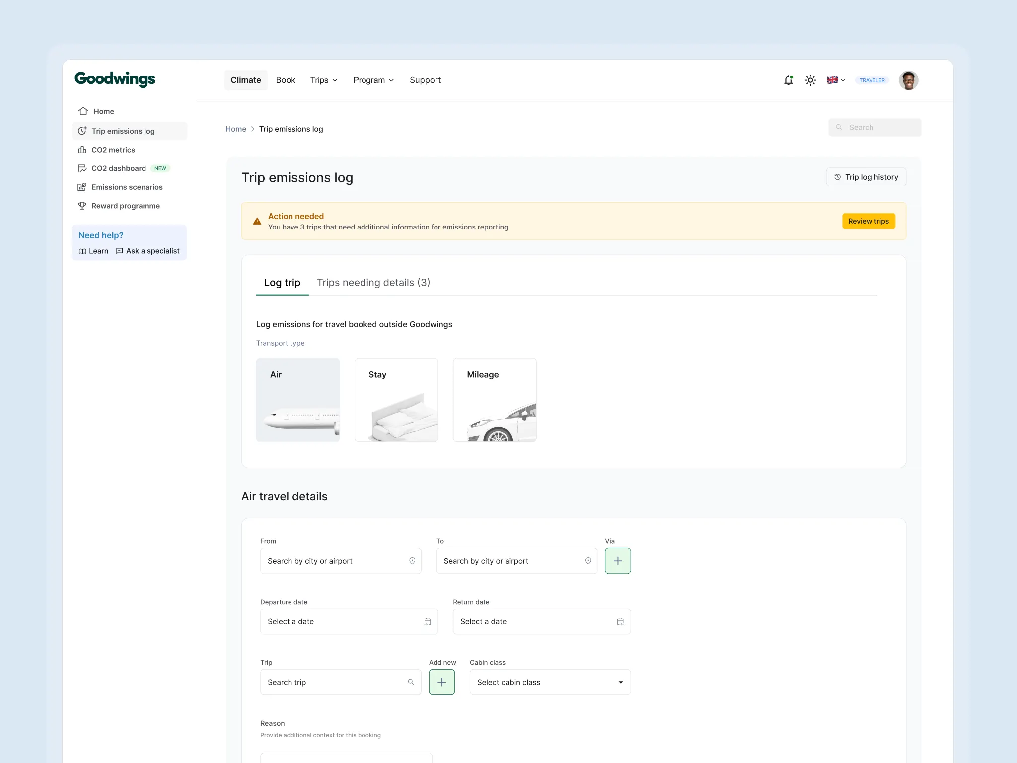
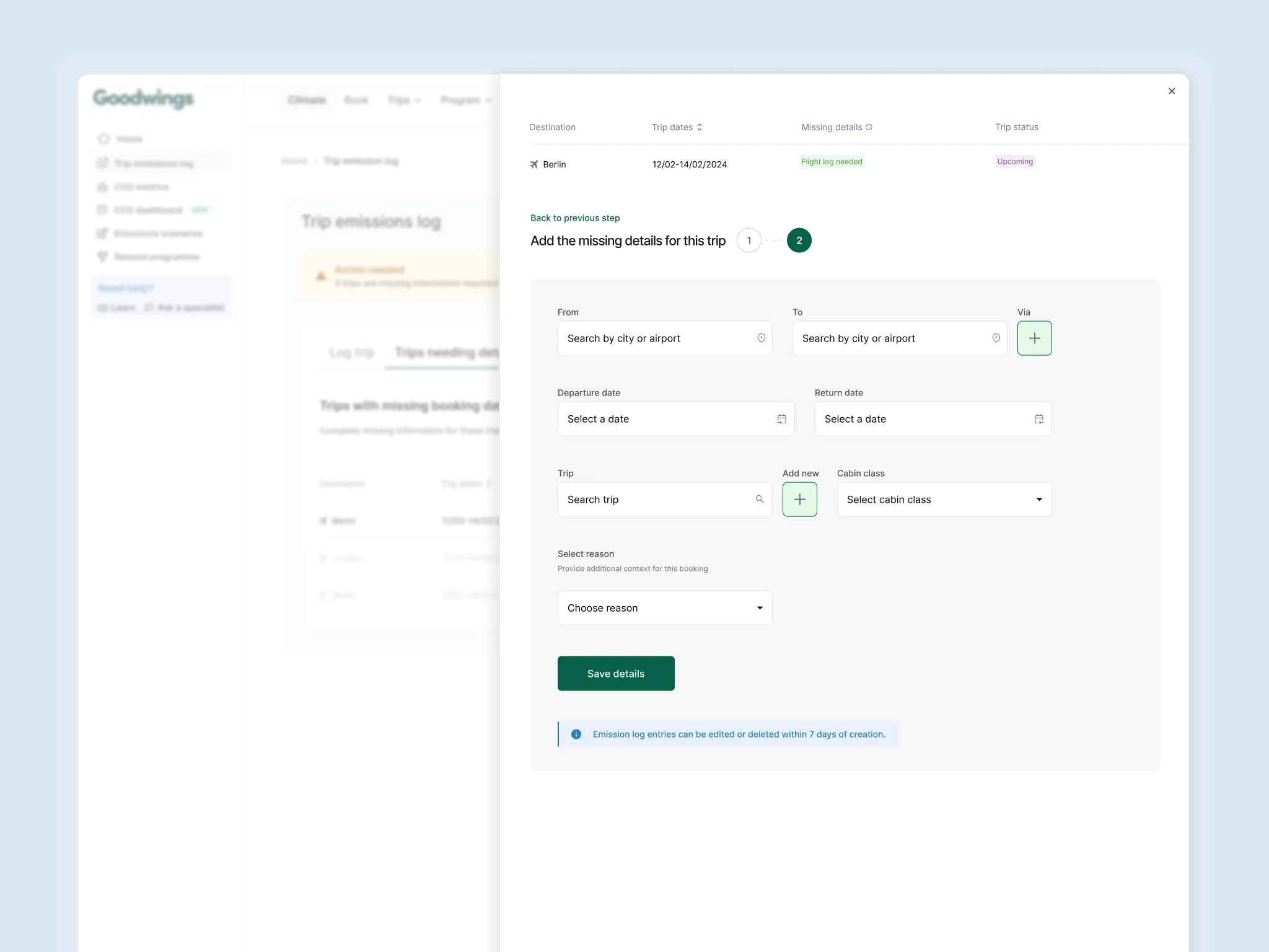
The traveller side — minimum friction, maximum completion
Every decision came back to one question: what would make Clara abandon this right now, and how do we remove that thing?
Direct link from email into the specific trip — no login wall, no navigation, no account setup. A login wall before someone has even seen what is being asked is an abandonment point dressed up as a security feature. The benefit of removing it far outweighed the cost.
Only the missing fields — labelled in plain language, single submit action. Every additional element on that screen was a reason to leave.
Immediate confirmation — trip marked complete, data received. Two things happen when you close the loop visibly: Clara trusts that her submission worked, and she feels her action had a real outcome. Both matter for current completion and for how she responds to any future request.
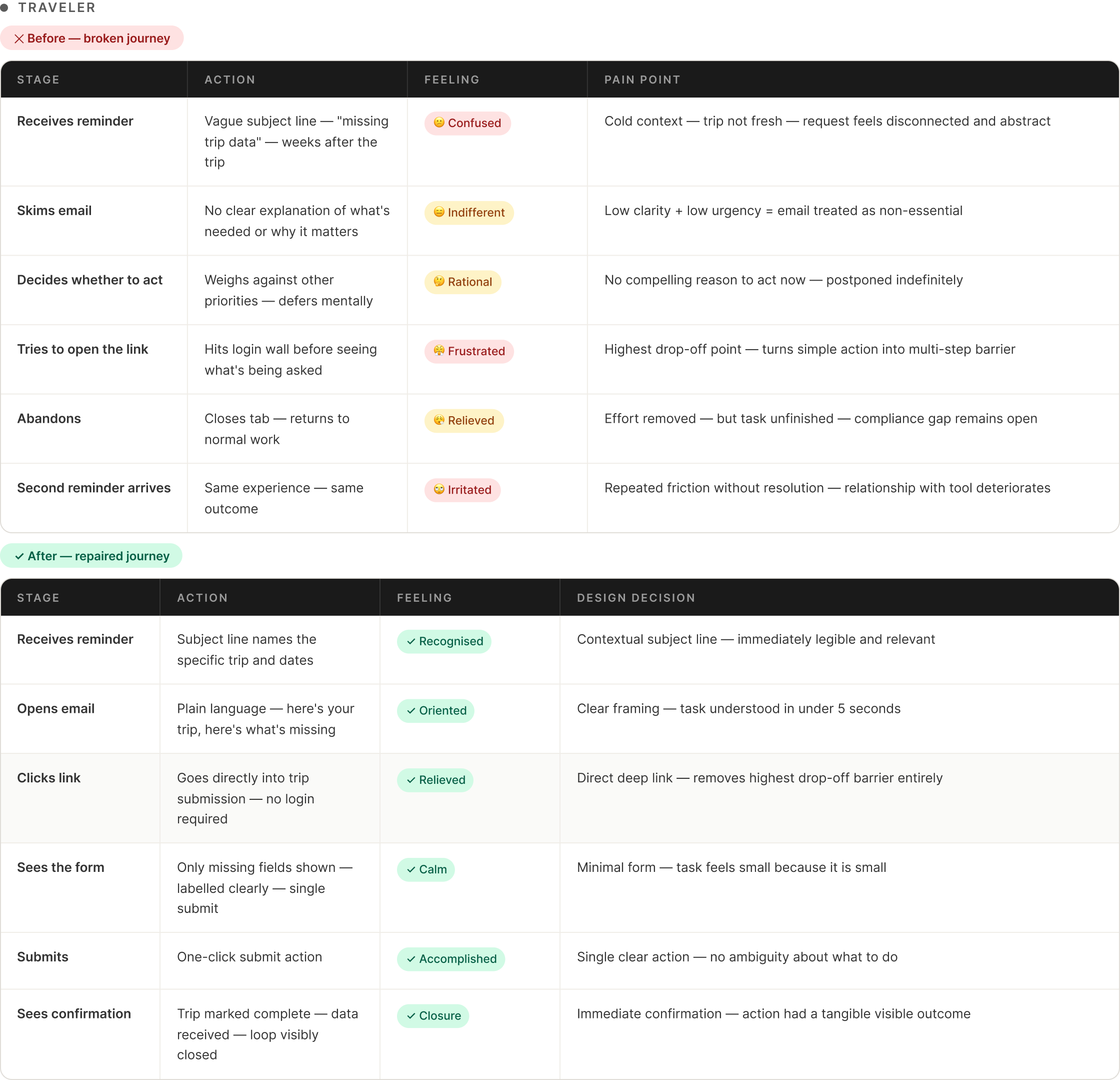
A meaningful iteration
An early version of the traveller flow included a short paragraph explaining why emissions data mattered — ESG reporting, climate targets, the company’s obligations.
Testing showed a consistent pattern: Clara-type users read it, felt the task was more complicated than they had assumed, and were more likely to close the email without completing the form.
The explanation was cut entirely.
The instinct was that context would motivate. The reality was that cognitive load at the moment of action is the enemy of completion — adding information, however well-intentioned, raises the perceived effort of the task before a single field has been filled. Clara did not need to understand ESG reporting. She needed a clear task, a clear path, and confirmation that it worked.
Design system and constraints
All screens were built within Goodwings’ existing design system — shaping how urgency and missing data states were communicated without introducing new components that would add engineering overhead or break consistency across the wider platform. The hierarchical table pattern for the Compliance Owner view came from adapting existing data table components, keeping the engineering lift low and the interaction model immediately familiar to anyone already using the product. Working within those constraints produced a simpler solution than a blank canvas would have.
Outcome
The connected system replaced something where neither side could tell if the loop had ever been closed.
For Thomas — one place to see the full shape of compliance gaps and act at scale. Automated reminders replaced manual scheduling. Real-time updates meant progress was visible as it happened, not hours later in a batch process. The dashboard became one of the most-used parts of the platform for teams with active ESG obligations — not because it was required, but because it genuinely made a difficult job manageable.
For Clara — a submission path where every identified barrier had been removed. The drop-off points that research had mapped — the cold context, the login wall, the oversized form, the missing confirmation — were each addressed directly. Completion rates improved as a result.
What the system did not solve was the upstream problem of why travellers book outside the platform in the first place — loyalty points, tool gaps, last-minute bookings. That remains a separate and larger challenge. What this work did was make the recovery from those out-of-tool bookings reliable instead of haphazard.
The question at the start was how to close data gaps without creating new burdens. The answer was simpler than it first appeared: understand precisely what was making both sides fail, and remove those things. Not through persuasion or education — through reduction.