Allergator — Allergy Tracking App

Allergic reactions don’t announce themselves. They happen mid-commute, at a restaurant, during a school run — moments where attention is already stretched and the last thing someone needs is a complicated tool. A UX concept for a wearable-connected app that monitors allergen exposure passively and escalates only when the user needs to act.
The problem
Most allergy apps are built around logging — you record what happened after the fact. That’s useful for patterns, but useless in the moment a reaction starts. For people managing serious allergies, or parents keeping their child safe, the gap between “I should check” and “I need to act now” can matter a lot. Research showed that users consistently abandon tools that demand attention in high-stress situations. The more steps between the user and the information they need, the less the product gets used when it counts.
Approach
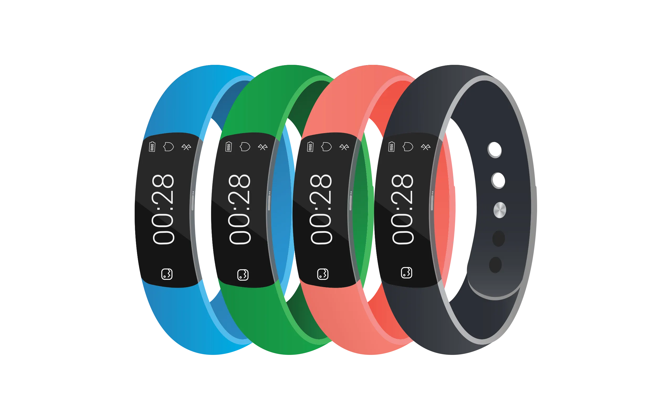
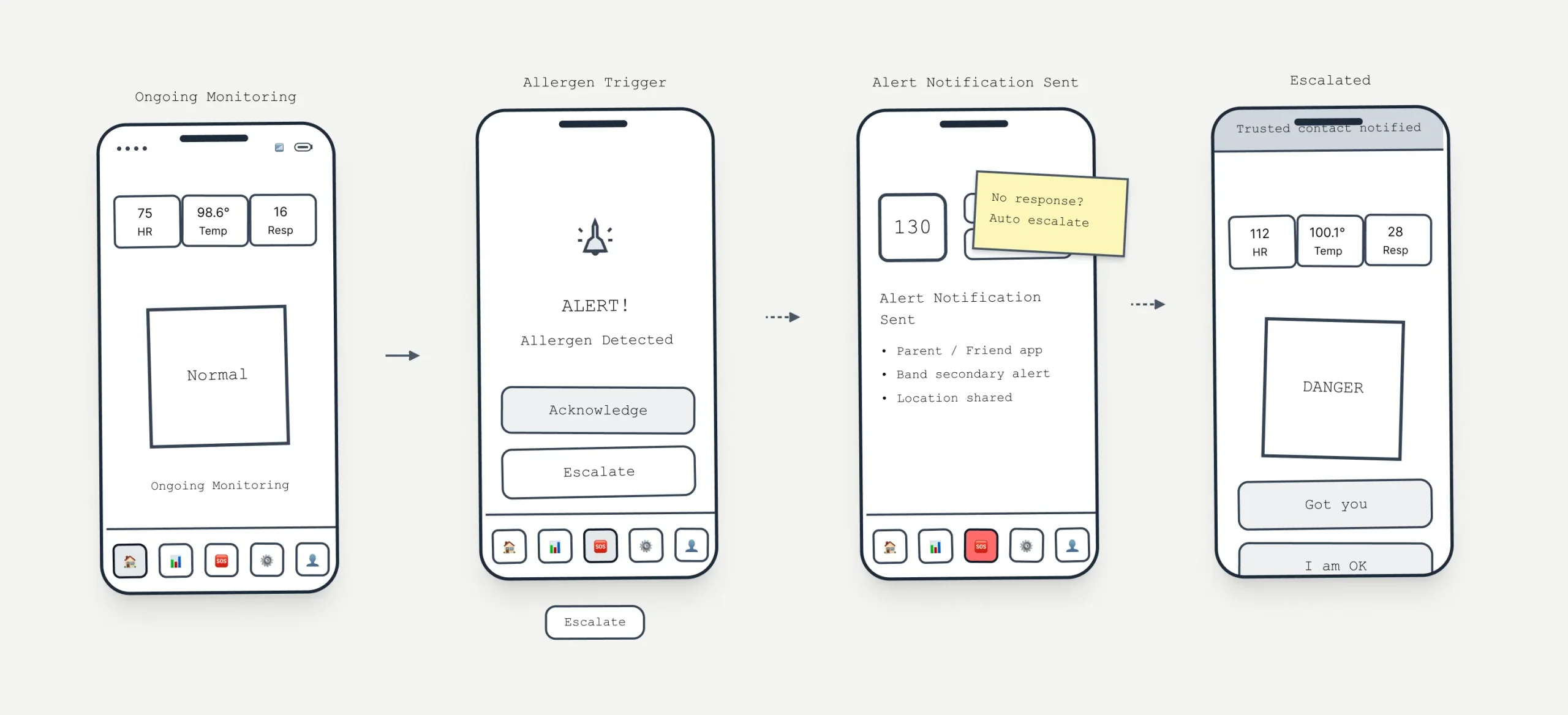
Rather than asking users to do more, the concept offloads detection entirely to a wearable. The phone becomes a response tool, not a monitoring one — it stays quiet until there’s something worth surfacing. Two principles drove every decision: don’t interrupt unless necessary, and when you do interrupt, make the next action obvious.
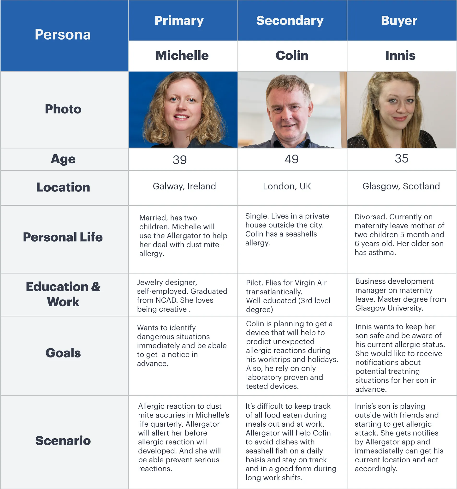
Who we designed for
Three distinct users shaped the work: adults managing their own allergies day-to-day, children who may not recognise or communicate symptoms in time, and parents who need to monitor remotely without being in the room. The contexts are very different, but the core need is the same — confidence that something is watching, even when they’re not.
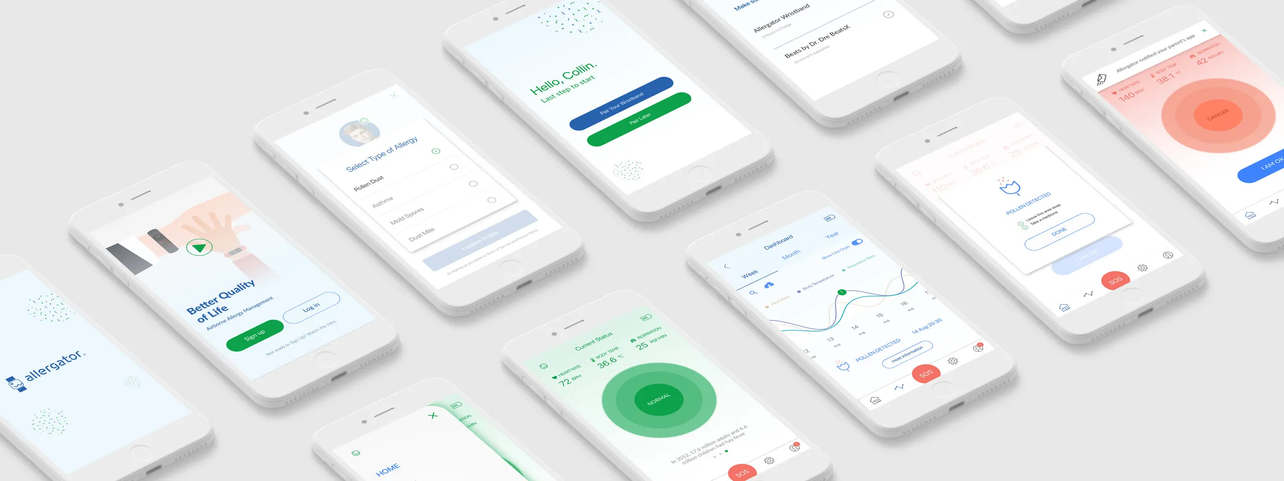
Flows & interaction
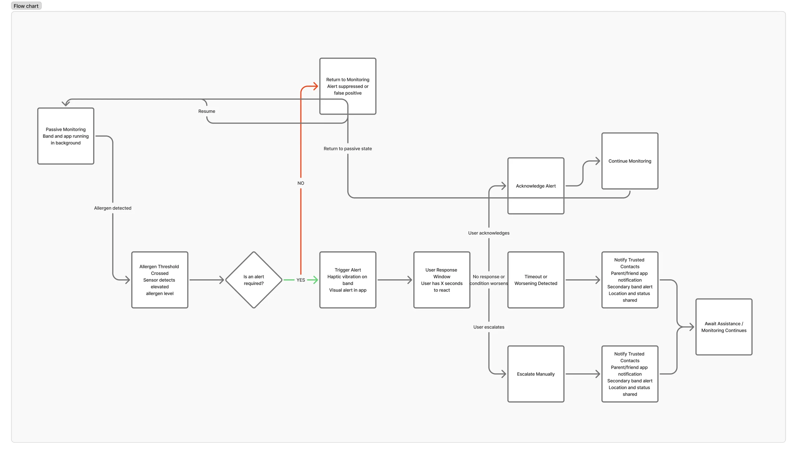
Scenarios were grounded in real contexts — commuting, exercising, eating out — where cognitive load is already high. I mapped every decision point: when does the app stay silent, when does it nudge, when does it demand attention? The interface centres on a single status view. It stays calm until it can’t, then escalates through a clear sequence rather than dumping information all at once.
Iteration
Early wireframes were deliberately rough — the goal was to pressure-test the logic before touching visual design. Can a panicked parent find the emergency action in two seconds? Does the calm state actually feel calm, or just empty? Each round of refinement stripped something out. Navigation simplified. Labels shortened. The hierarchy got clearer by removing, not adding.

Visual system
The visual language mirrors the UX logic. Calm states are quiet — low contrast, muted colour, nothing competing for attention. When something changes, the shift is immediate and hard to miss: contrast jumps, colour saturates, motion repeats. The goal was to communicate urgency without adding cognitive load at exactly the moment users have the least capacity to process it.