

Parexlanko — Mobile App & Site Stage Tracking
Parexlanko is a French construction materials manufacturer — facade coatings, tile adhesives, and thermal insulation systems applied on building sites. This app was designed for their applicator teams to document each product application stage directly on site.
The problem
The core challenge wasn’t the data itself — it was the context it was collected in. Field inspectors work across multiple sites, juggling different project stages simultaneously. The existing process was fragmented: there was no clear order to follow, no way to see what had already been done, and no guidance on what was still missing before a stage could be closed. Documents got missed. Forms were submitted incomplete. Progress had to be tracked manually. The brief came from a direct user need: site managers wanted to finish each stage correctly and move on without second-guessing whether something had been missed.
Approach
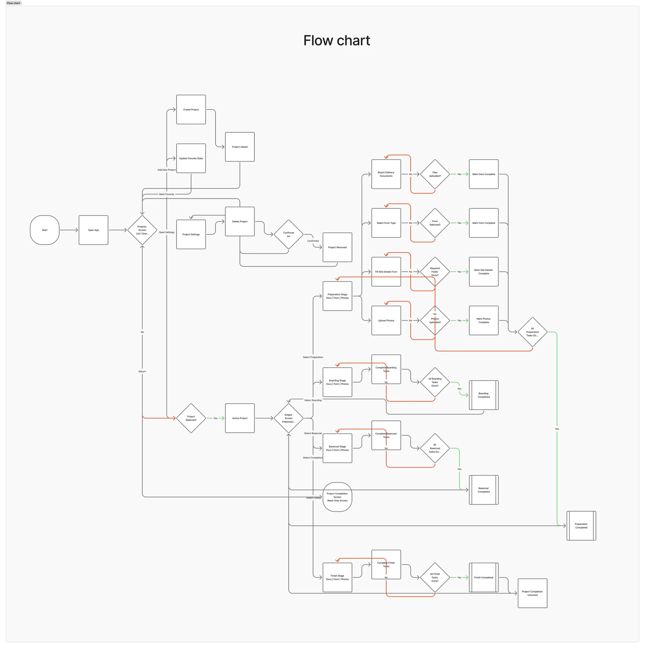
The key decision early on was to design around a single repeatable stage template — rather than treating each project phase as its own separate flow. Every stage follows the same three-step structure: attach delivery documents, fill the required form, upload photos. Once you know the first stage, you know all of them. This reduced the design problem significantly. Instead of building four different flows, I focused on making one flow work really well in difficult field conditions — large tap targets, minimal on-screen text, visible step progress, and auto-save so work can be paused and resumed without losing anything. The admin and engineering teams were involved early to validate what “complete” meant for each stage — which fields were required, which were optional, and what the system needed before a stage could progress. That shaped the form logic and the completion states throughout.
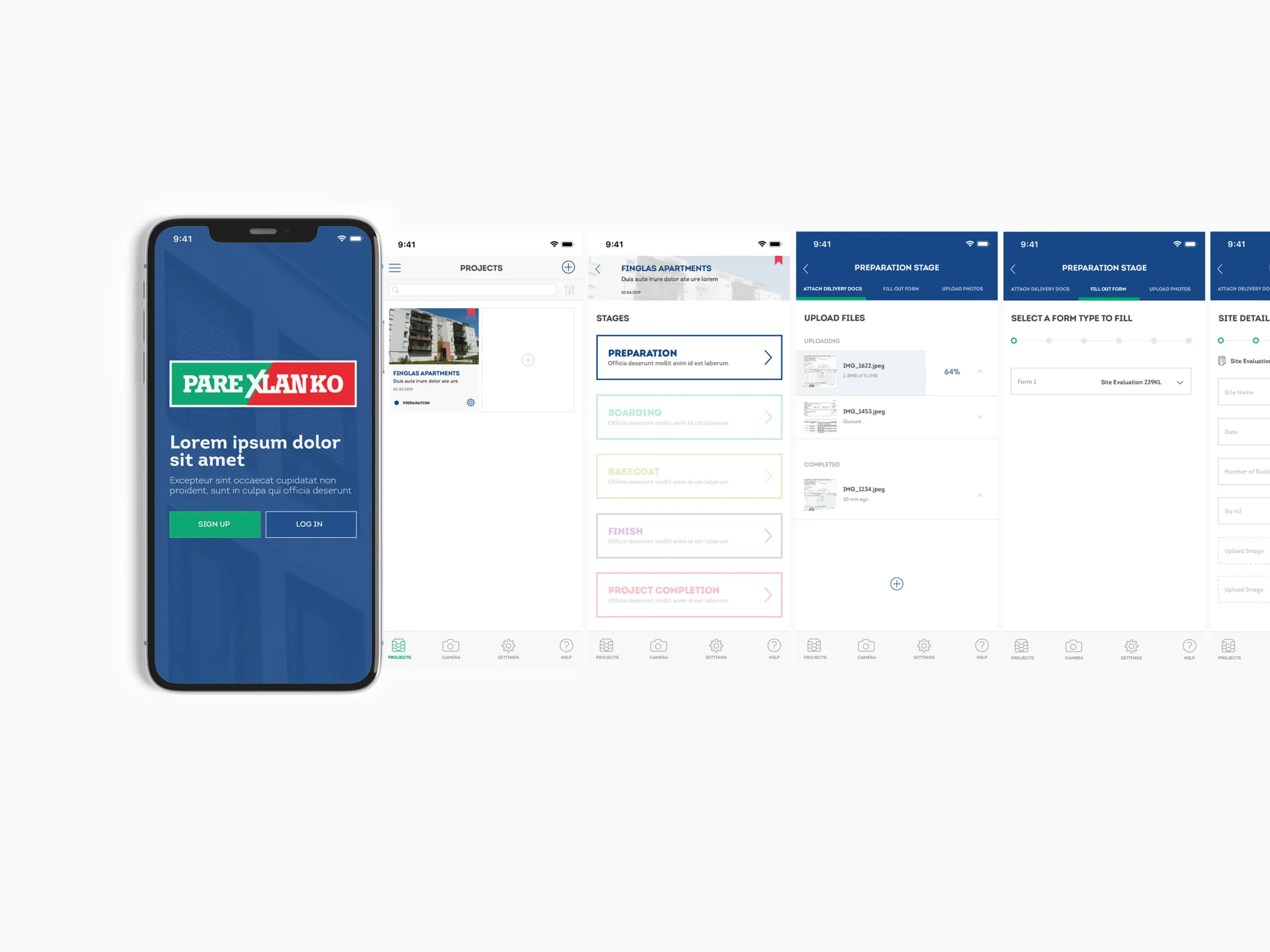
User journey
The journey starts at the project overview, where the user selects the active stage. From there, the three steps are visible upfront — documents, form, photos — with clear progress indicators showing what’s done and what’s outstanding. Steps can be completed in any order, and progress is saved per step, so partial work isn’t lost if the user has to leave and return. Once all three steps are complete, the stage is marked as finished and the next one becomes available. The same pattern repeats across Preparation, Boarding, Basecoat, and Finish — making the whole app predictable after the first use.
Interface
All screens were designed mobile-first for challenging field conditions — strong contrast, generous touch targets, and a minimal interface that doesn’t require reading before acting. The stage indicator is persistent, so users always know where they are in the overall project without having to navigate back.

Outcome
The single-template approach meant inspectors only had to learn the flow once. After completing the first stage, the remaining three followed the same pattern — reducing errors and making it possible to work faster without compromising completeness. Missed documents and incomplete form submissions dropped because the interface made it obvious what was still outstanding before a stage could be closed. The stage model also proved easy to extend — adding new phases or adjusting step requirements didn’t require redesigning the interaction pattern, just updating the content within it.