375 skateboards — Skate Brand Branding

Branding for a friend’s skate brand — built around a seasonal logo system made from simple geometric shapes that shift and rearrange across drops.
The idea
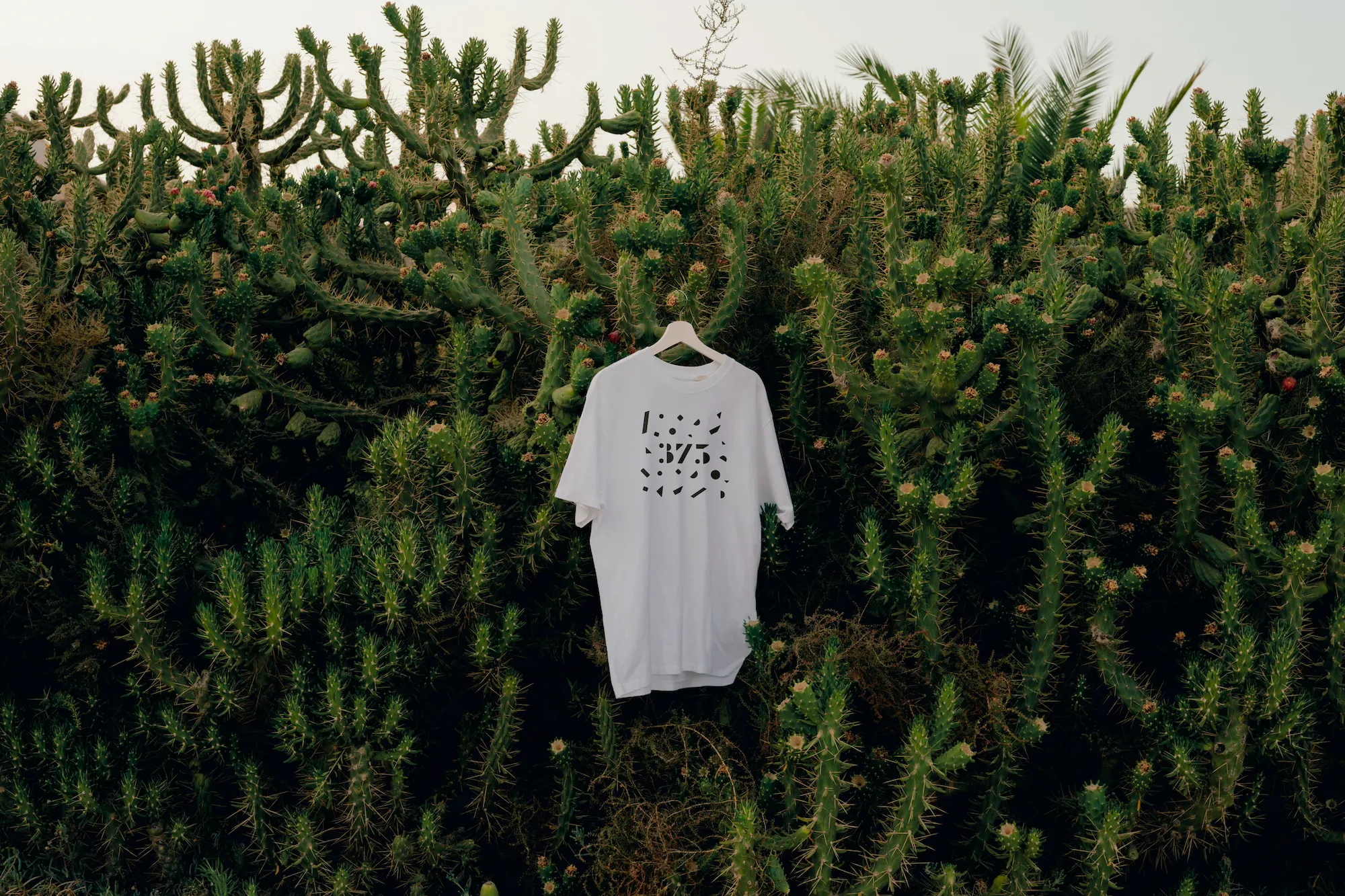
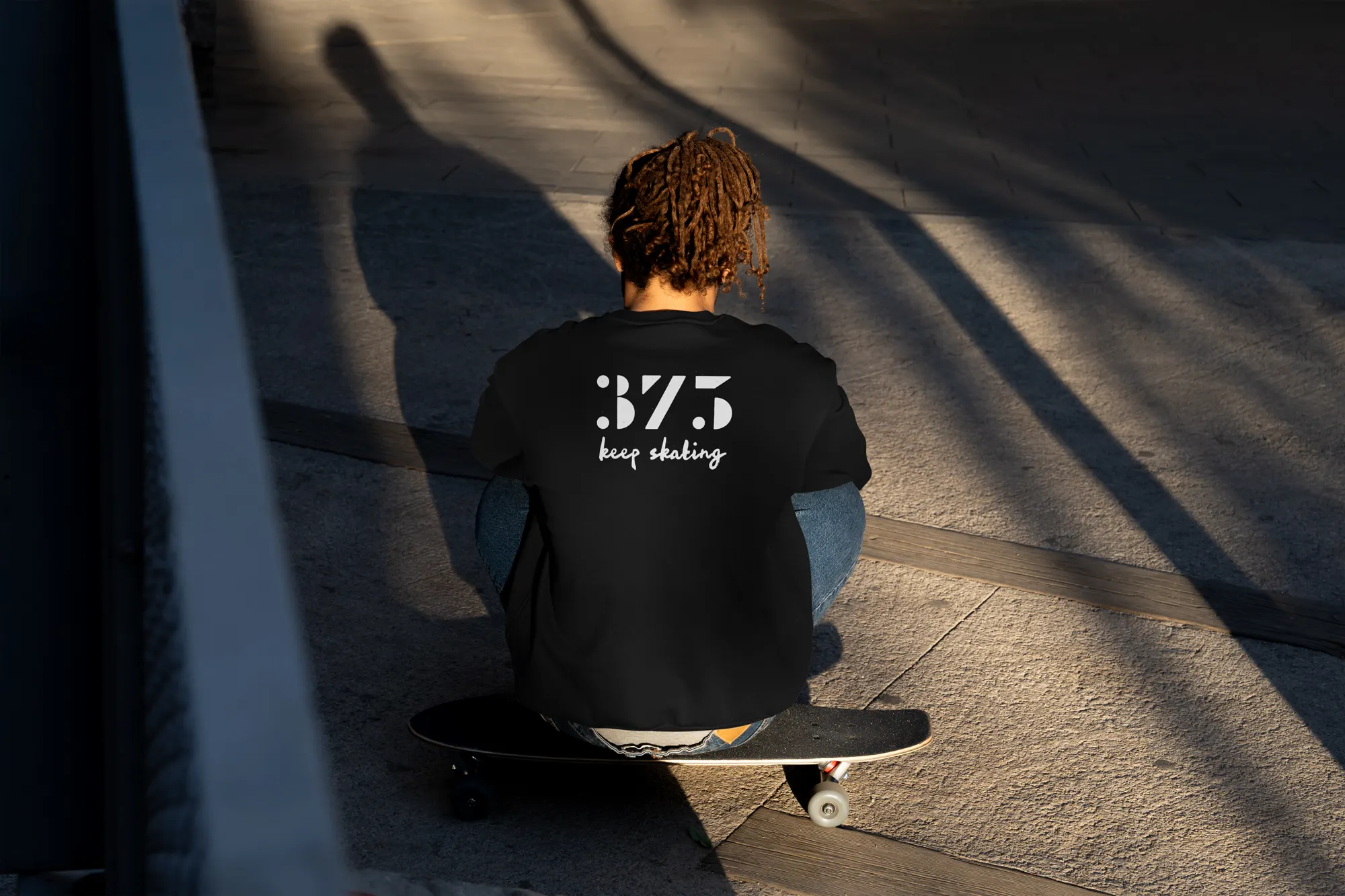
Instead of a fixed logo, we created a visual language from geometric shapes that can be recombined over time. The thinking was that a rigid mark would feel out of place for a skate brand — too finished, too corporate. The shapes stay the same but the arrangement changes with each season or release, so the brand has continuity without being locked down. Simple and playful, and deliberately open to change.
How it lives
The system has been applied to T-shirts and skateboard decks, where it works as part of the product rather than a mark printed on top of it. The geometric forms scale well and hold up in print, which was important for deck graphics where the design needs to survive the physical object.