

Goodwings — End-to-End Website Redesign
Intro
Goodwings is a B2B travel management platform combining booking, policy control, and sustainability reporting in one product. This is a full website redesign: a system of layouts, visual language, and messaging built to explain a complex platform in a clear, trustworthy way.
The site needed to speak to multiple audiences — travellers, travel managers, finance, and sustainability teams — while staying easy to scan and quick to act on.
The Problem
The existing site wasn’t converting, and the reasons ran deeper than visual style.
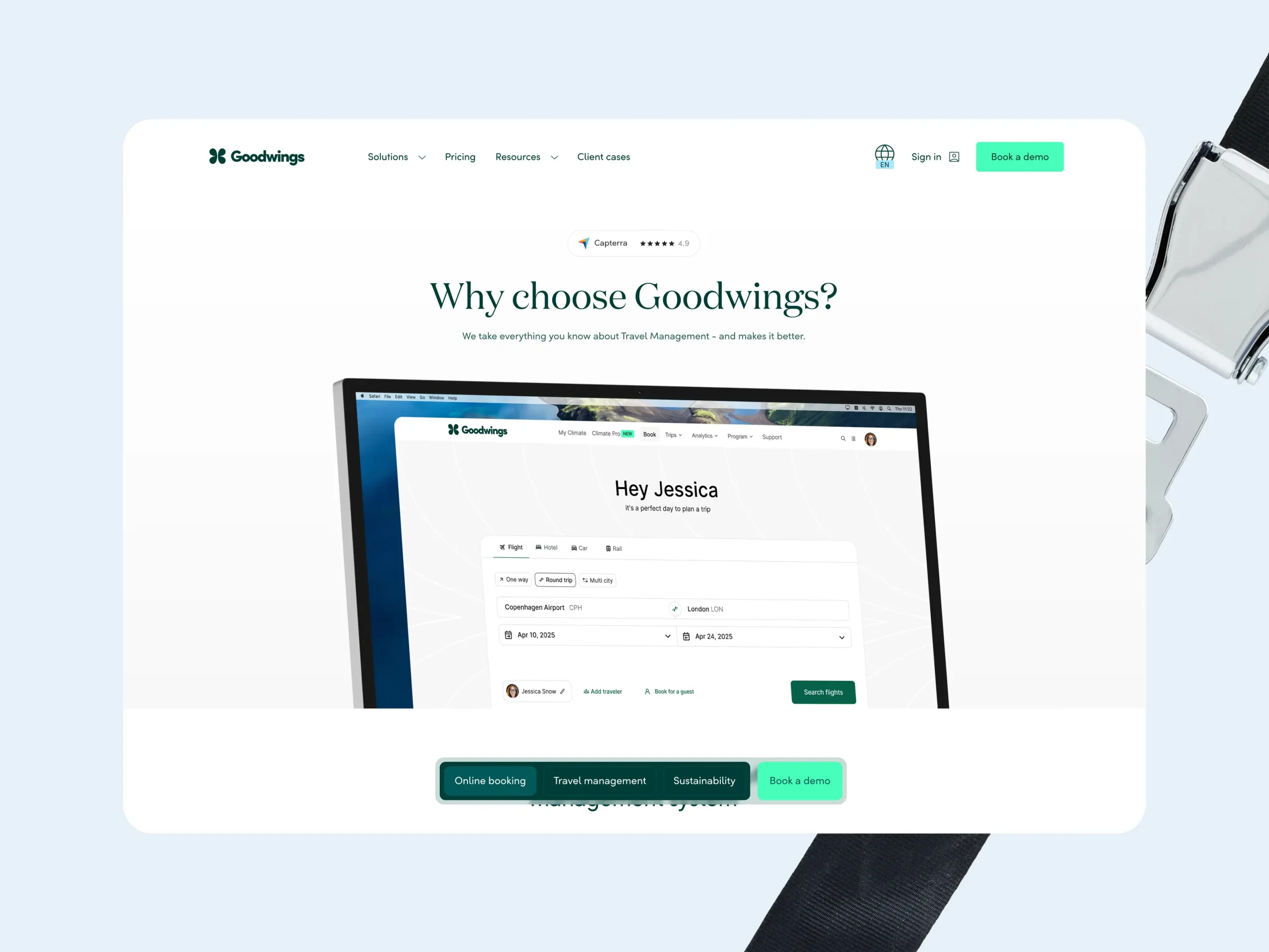
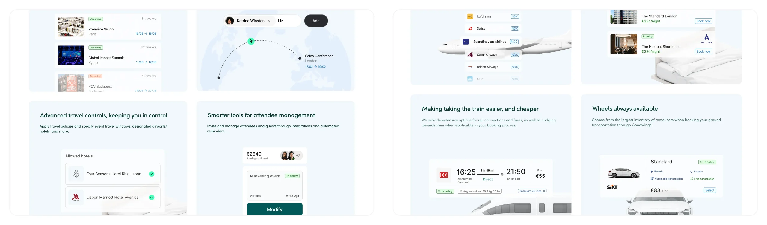
Dashboard screenshots lifted directly from the product were being used as marketing visuals. Complex, data-heavy UI that overwhelmed visitors rather than helping them understand the value. There was no consistent visual language around features, no visual patterns that gave a prospect confidence.
The positioning was also off. The site led so heavily with sustainability that the core travel management product got buried. It read more like a campaign than a software platform, and sales were hearing the same objection from prospects: they didn’t trust it was a real, enterprise-ready tool. Brand trust was being undermined by the very messaging meant to differentiate it.
A previous agency refresh had tried to modernise the look, but the changes were surface-level. New colours that ended up feeling harsh and playful rather than premium. The visual language and underlying narrative hadn’t changed.
Stakeholder conversations across marketing, sales, sustainability, and CS helped map the competing priorities. Each team had a different angle, and part of my job was establishing a hierarchy that could serve all of them.
Approach
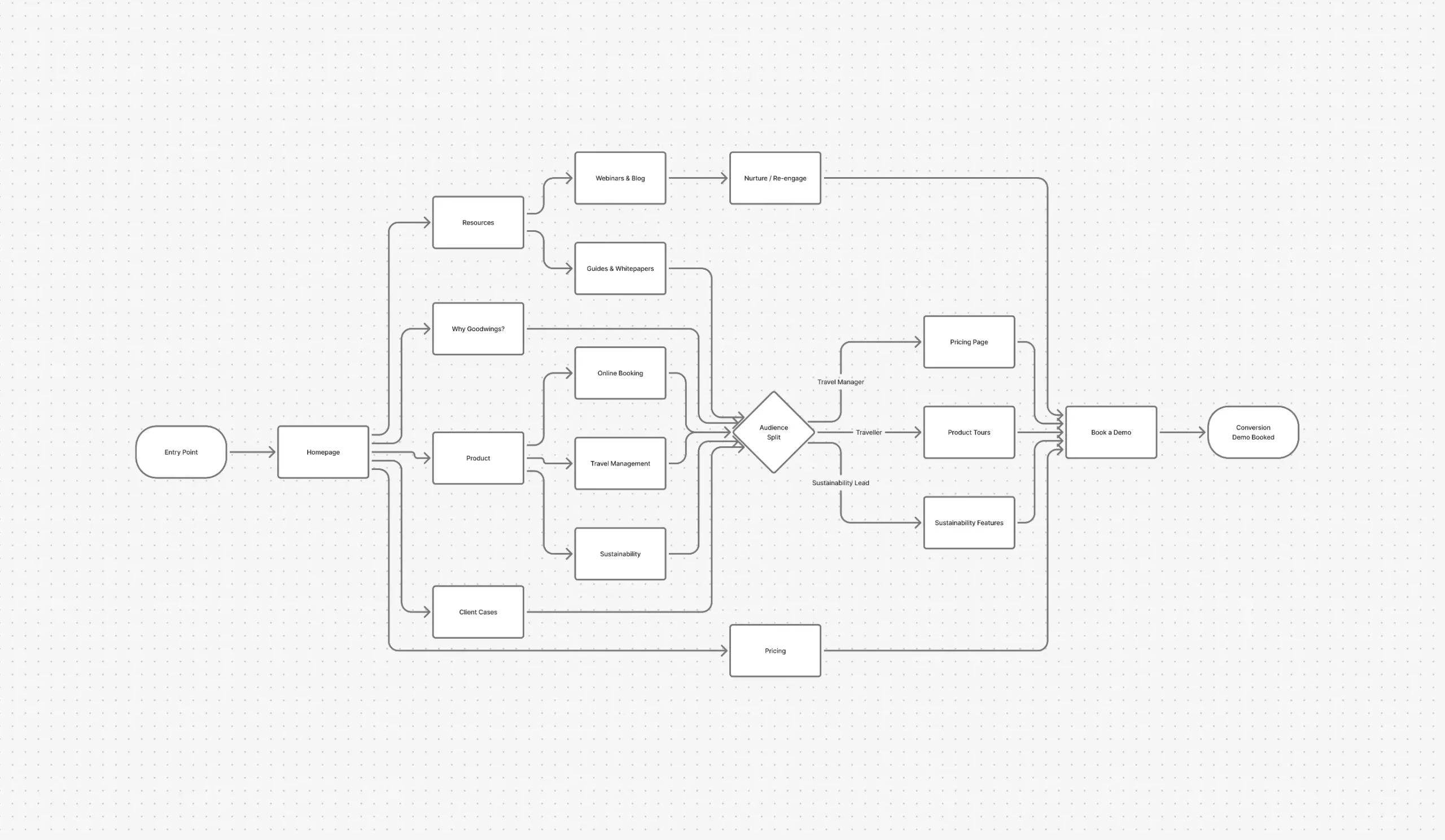
I started with wireframes to define structure and hierarchy across pages before touching visual details. This helped align stakeholders early and kept decisions grounded in content and user flow rather than aesthetics.
Mapping out the user flow early was critical. The site serves multiple audiences with different entry points and goals — a travel manager evaluating pricing, a traveller exploring the booking tool, a sustainability lead looking at ESG reporting. The navigation and page hierarchy needed to serve all three paths while converging on a single conversion goal: booking a demo.
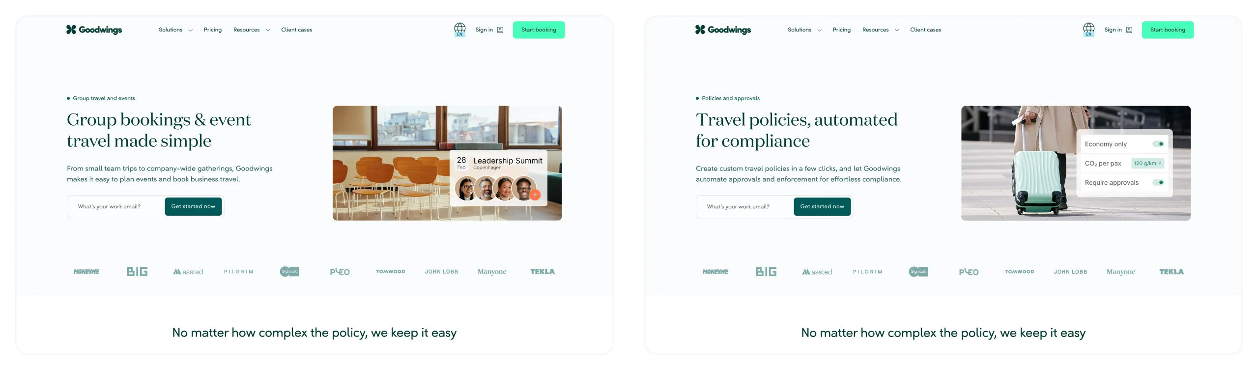
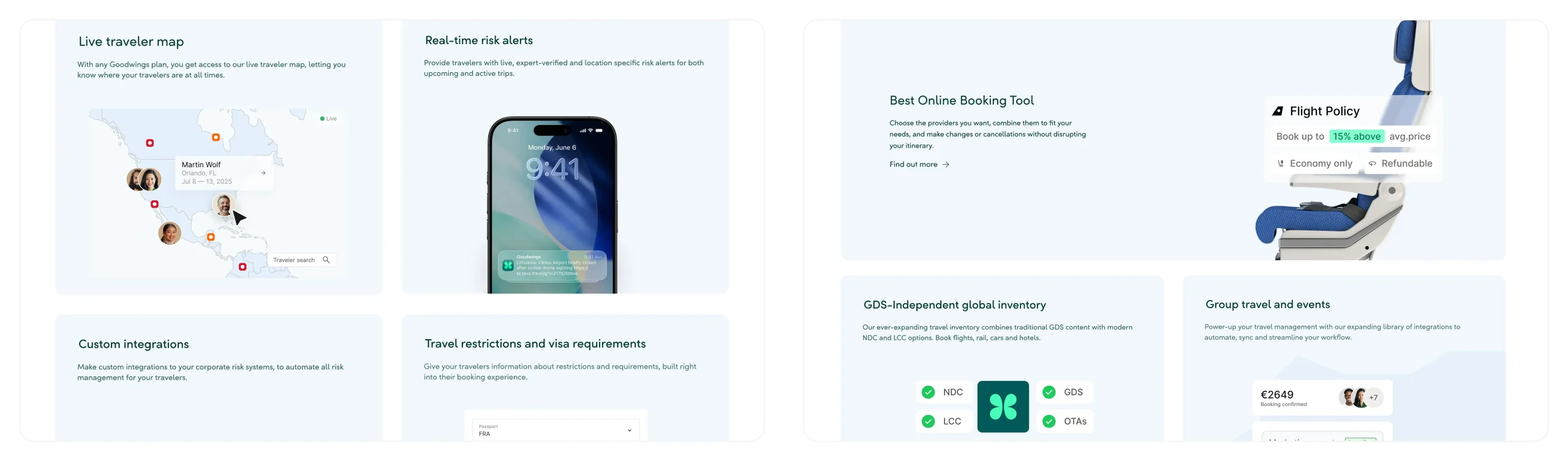
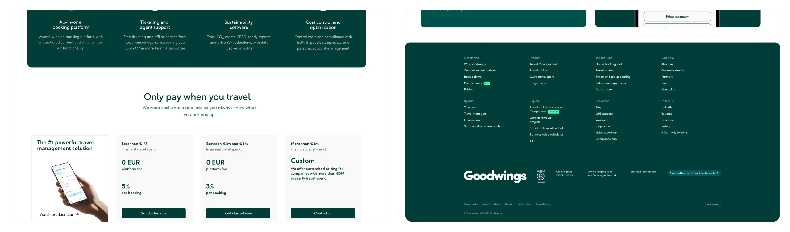
Competitive analysis shaped the direction. Most TMS platforms share the same visual patterns: cold, corporate, data-heavy. We made a deliberate decision to go a different way, building a visual language that felt more like modern B2B SaaS, where product clarity comes first and sustainability is part of the story rather than the headline.
Decisions were validated through internal reviews and user testing. A/B testing checked scannability and conversion, while Hotjar heatmaps and session recordings showed how users actually moved through pages, informing layout, content order, and calls to action.
Visual Direction
The visual direction focuses on clarity, hierarchy, and calm confidence. The goal was not decoration but a visual language that makes the value proposition readable at a glance and builds brand trust from the first scroll.
This meant designing layouts alongside visual metaphors and custom graphics that explain features simply, replacing raw dashboard complexity with conceptual visual patterns focused on a single feature narrative at a time. Aesthetics serve understanding and action.
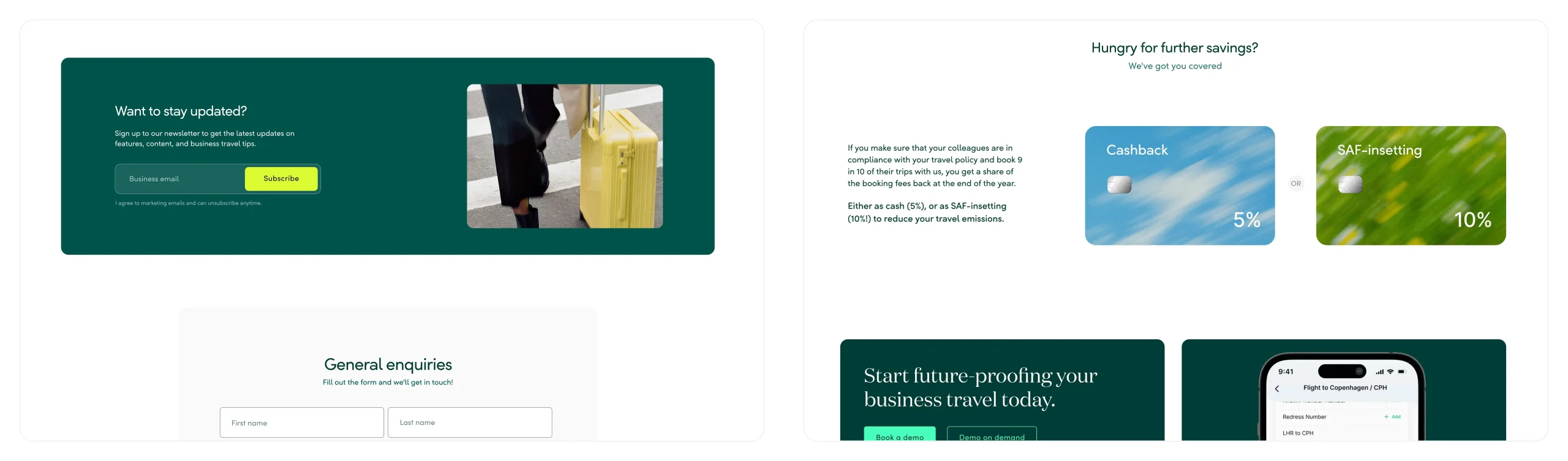
Sustainability without Greenwashing
Previously the brand positioned sustainability first, travel management second. In this redesign I aimed to balance both: a tech-first travel product where sustainability is integrated across all flows, not added as a marketing layer.
Sustainability shows up in visual language, messaging, and product explanations without false claims or visual clichés. The goal was to rebuild brand trust around a product that genuinely delivers on both sides of that promise.
Accessibility & Performance
The website was designed to be fast, mobile-first, and accessible, following EEA and WCAG standards. Performance and readability were treated as part of the design quality, not technical afterthoughts.
Outcome
The redesign had a measurable impact. Time on site increased around 4x after launch, bounce rate dropped significantly across key landing pages, and hard conversions improved by over 200%. Navigation depth also increased, reflecting how much clearer the product story had become for first-time visitors.
Sales reported stronger prospect conversations after launch. With the product finally shown clearly and brand trust established earlier in the journey, the objections that had been slowing the pipeline became far less frequent.
The result is a site with clear visual language and consistent visual patterns: human, trustworthy, and premium, while communicating a complex product and supporting conversion across different audiences.
I owned UX and UI across the full website: layout and component system, visual language and interaction patterns, and custom graphics and illustrations.