

Mac Digital — Brand Identity & Web
Mac Digital is a Dublin-based marketing agency specialising in tourism and destination marketing, working with tourism boards and travel brands across Ireland and internationally. The brief came as part of a full company relaunch — Mac Digital 2.0. New office, new website, new printed materials, new positioning. The identity needed to match that ambition: a refined logo, a proper type system, and brand guidelines that could carry everything forward consistently.
The Problem
The existing identity had the right foundations but needed sharpening for where the agency was going. The logo symbol was refined, the typography overhauled, and the whole system documented into guidelines for the first time — giving the team something they could actually use without making visual decisions from scratch every time.
Identity & Brand System
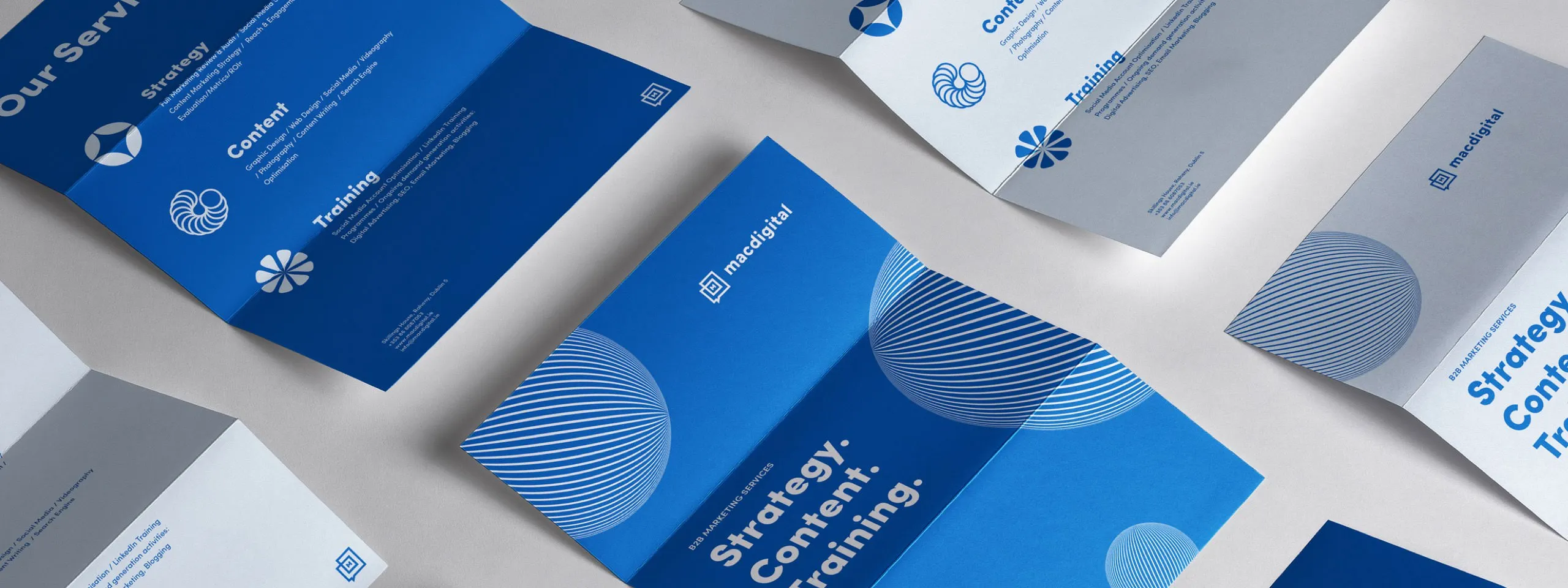
The logo was built on a geometric “M” mark — structured, stable, and distinctive enough to work as a standalone symbol across digital and physical touchpoints without the full wordmark. A strict grid system underpins everything: balance and clarity built in from the start, so the identity would hold up long-term without needing constant adjustment.
The visual language is deliberately calm. A soft, restrained colour palette. Custom icons and illustrations. Clean, modern typography. The goal was a brand that felt personal and considered rather than corporate — which matters for an agency whose clients are built on culture, heritage, and place. Modern, but not trendy.


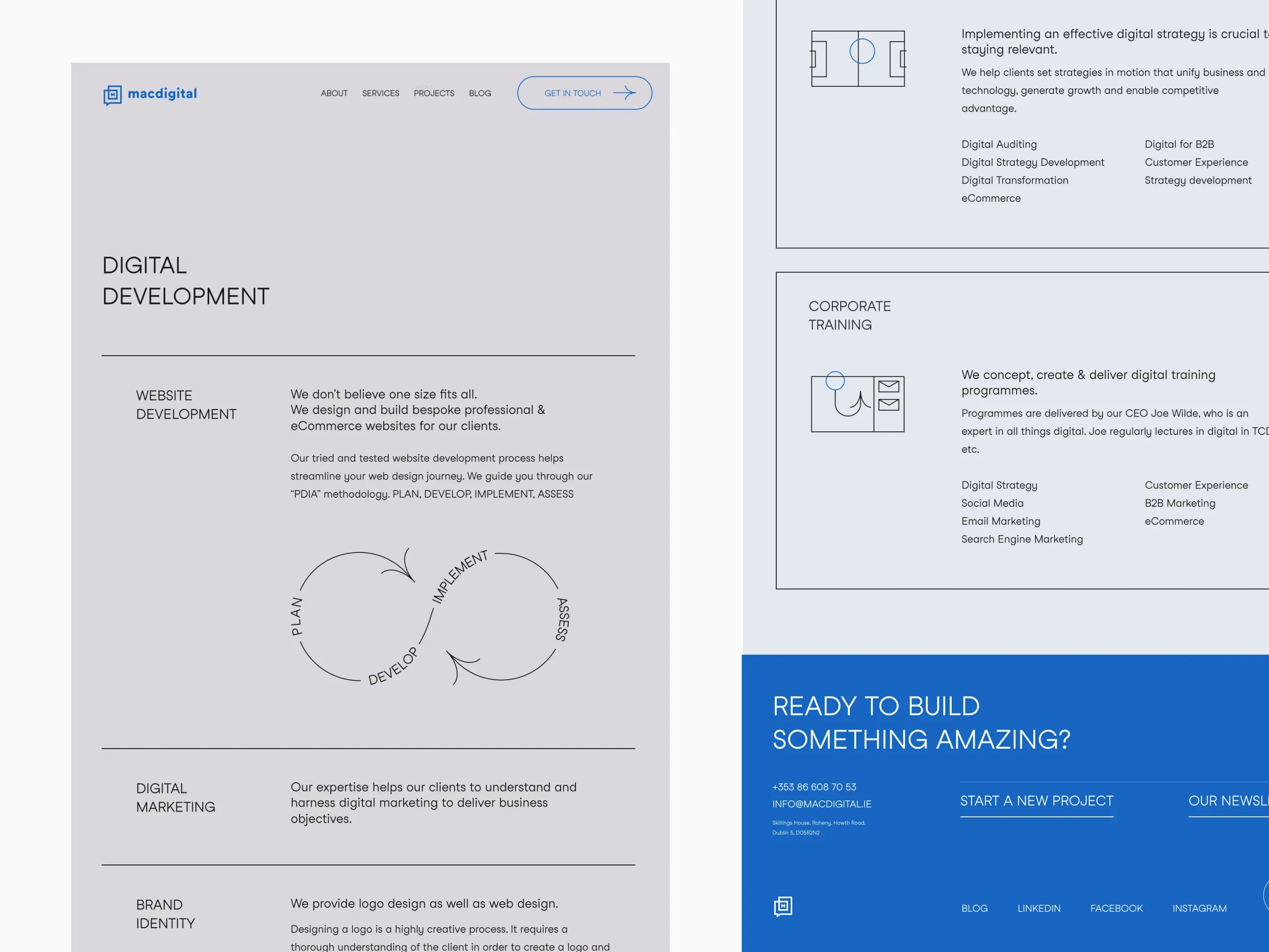
Website
The website carried the identity into its primary digital touchpoint, structured around the agency’s tourism specialism and the depth of experience behind it. The goal was the same as the brand: communicate credibility before a single conversation takes place.
Outcome
The rebrand repositioned Mac Digital at a different level entirely. Shortly after launch, the agency started attracting clients they hadn’t previously been able to reach — including Jameson Distillery and Guinness Storehouse, two of Ireland’s most recognised tourism destinations. A coherent identity didn’t just make the agency look better. It made them credible to clients who needed to trust their partner before signing anything.