

Sunrise — Digital Operations Consulting
Sunrise is a digital operations consultancy working with organisations navigating complex transformation programmes. The brief was a website — but the real challenge was the one that comes with every services business: how do you build trust with enterprise clients when there’s no product to demonstrate, no interface to show, nothing tangible to hand across the table? Everything has to come from how you present yourself.
The Problem
A competitor analysis made the landscape clear quickly. Most consultancies in this space were either stuck in corporate convention — heavy on credentials, light on clarity — or had overcorrected into startup-style marketing that felt wrong for the audience. Enterprise buyers aren’t looking to be excited. They’re looking to feel confident. The website needed to communicate operational depth and calm authority without tipping into either of those failure modes.
Language was as much a design problem as layout. The way Sunrise described its work had to feel precise and considered — not jargon-heavy, not oversimplified. Getting that register right shaped decisions about structure, hierarchy, and how much the visual design should assert itself versus get out of the way.
Design Direction
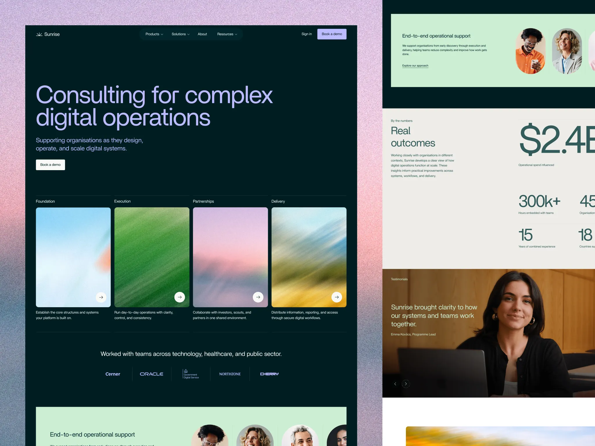
The visual approach was deliberately restrained. Generous spacing, controlled typography, abstract structural elements rather than photography or illustration. The reasoning was straightforward: for a services business, visual noise is a liability. Every element that doesn’t reinforce trust is a distraction. Abstraction was used purposefully — to suggest scale and systemic thinking without making claims the content couldn’t back up.
Content was organised around how Sunrise works rather than what it sells. Approach before services, principles before credentials. That sequencing was informed by what the competitor analysis showed: most sites led with capability statements that clients had no reason to believe yet. Building the logic first and the credentials second felt more honest — and more effective.
Mobile
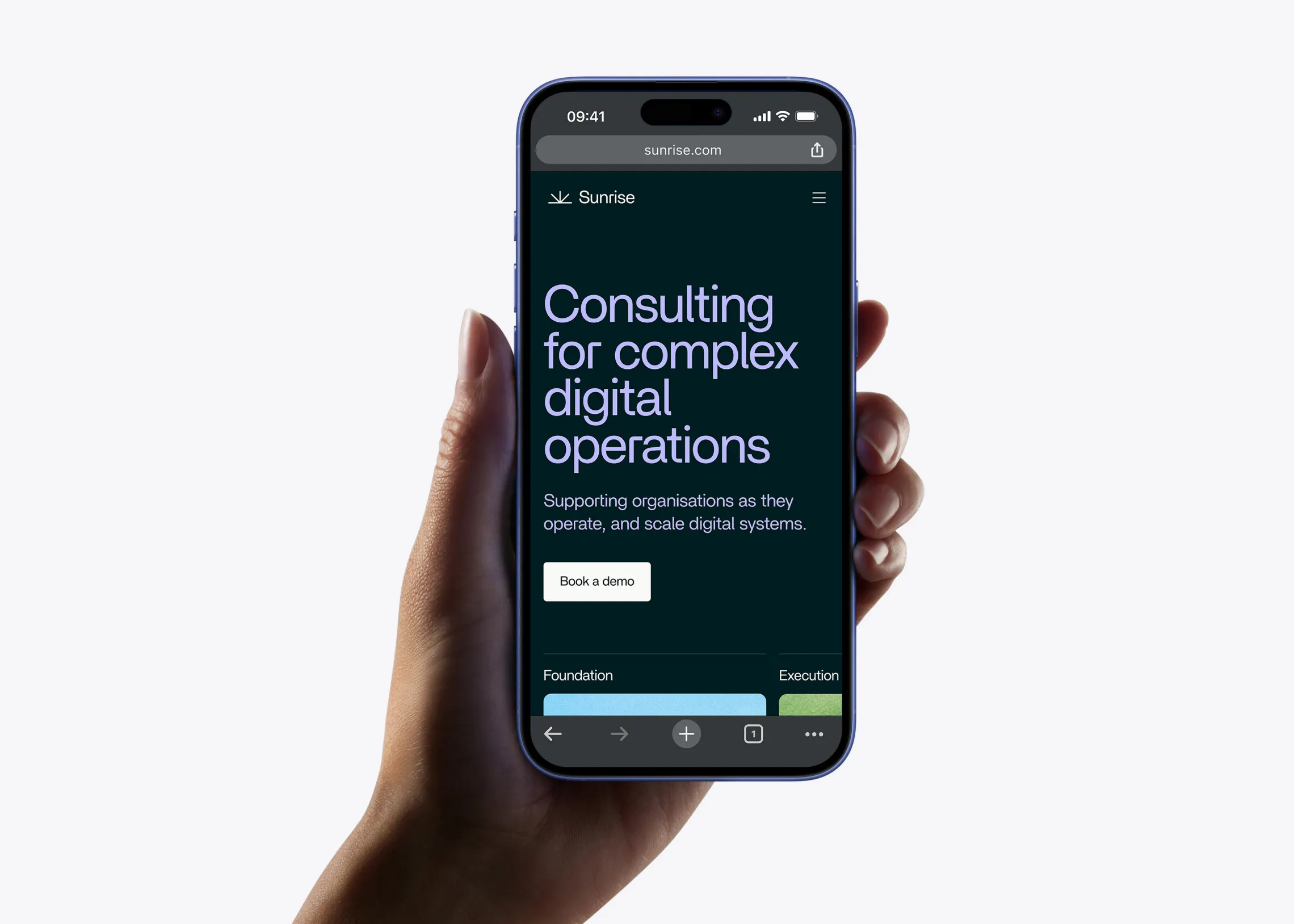
The mobile experience wasn’t an afterthought. Content was reorganised into a clear vertical flow that prioritises the core message, approach, and call to action — typography, spacing, and contrast adjusted to maintain the same sense of calm and hierarchy on smaller screens. Consulting decisions often happen in motion, so the interface needed to carry full weight at any size.

Outcome
A website that positions Sunrise as a credible, systems-oriented partner for complex operational work — without relying on the marketing conventions that would have undermined that positioning. The design makes the consultancy’s thinking visible before a single conversation takes place.