

Uizard — Website Concept
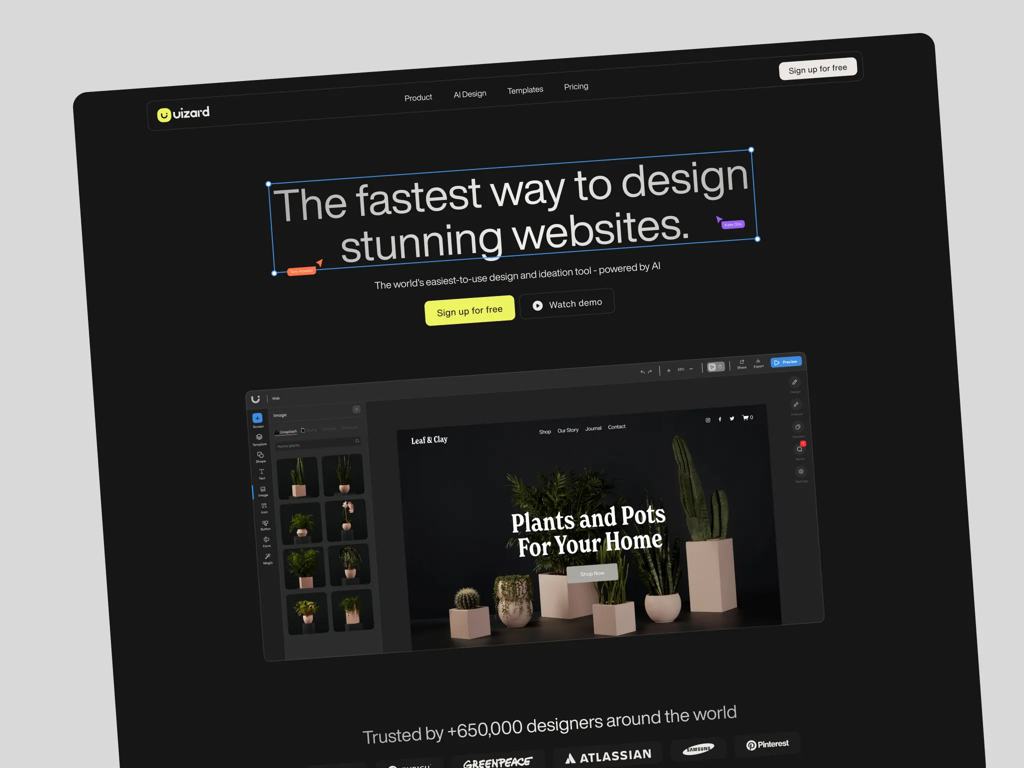
Uizard is an AI-powered design tool that lets non-designers and product teams build wireframes, mockups, and prototypes without writing code. When I came to work on this, the website hadn’t kept pace with where the product was going. The existing landing page was visually flat — a single dominant yellow, generic product screenshots, no real sense of the AI capabilities that were becoming central to what Uizard does. The brief was to rethink the visual language, introduce new sections for the AI features, and give the site a lot more range.
Visual Direction
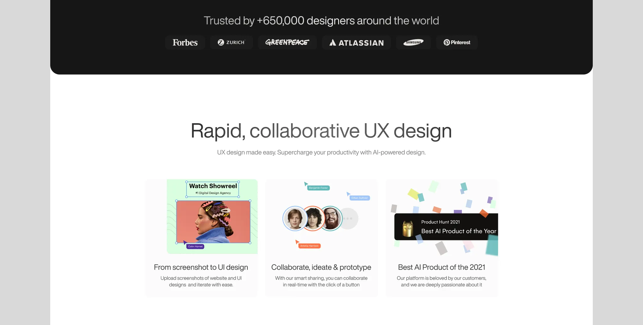
The first thing to address was the colour palette. A single accent colour works fine as a constraint but becomes a ceiling when a product has multiple distinct feature areas. Expanding the palette gave each part of the page its own visual weight without losing coherence. The existing brand yellow stayed — it’s distinctive and recognisable — but it got joined by a fuller range that could carry the product’s breadth more honestly.
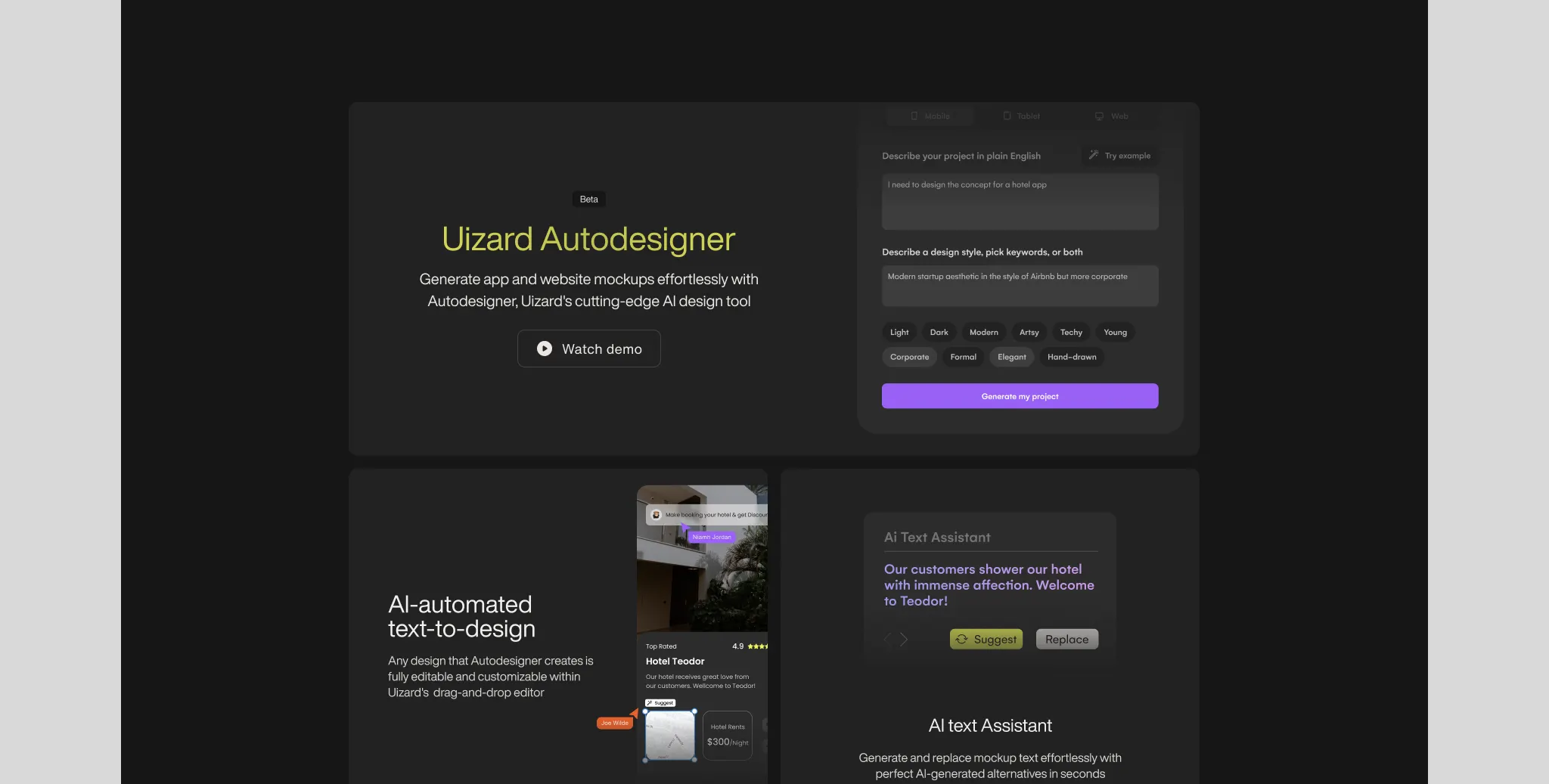
The AI feature sections were the most interesting design problem. Uizard was pushing hard into AI-powered generation, and that part of the product has a different feel to the core design tool — more powerful, more technical, a different kind of trust ask. I introduced a dark-themed section specifically for those features. It creates a natural break in the page, signals a shift in what you’re looking at, and gives the AI capabilities their own visual register without making the whole site feel heavy.
Typography and composition got a significant upgrade throughout. The existing site had the flat, slightly generic look of a product that grew quickly without much visual investment. Bringing in stronger hierarchy, better focal points, and more considered use of space made the product feel more considered — which matters when you’re asking people to trust a design tool with their work.
Components & System
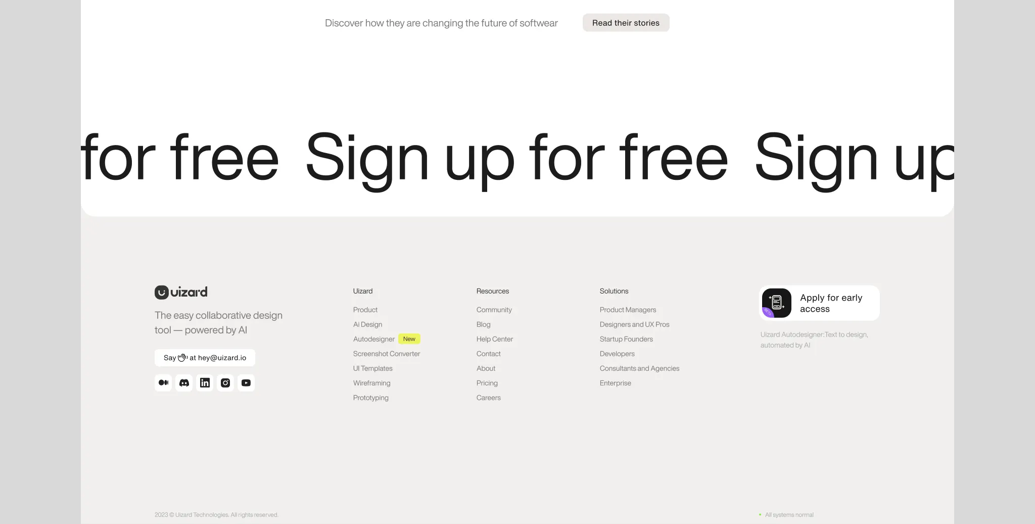
Alongside the page design I built out the component library — typography scale, colour tokens, buttons, navbar, marquee, animated sections. The idea was that the redesign could be implemented and extended without having to make visual decisions from scratch each time. Everything was documented and reusable.
Social Content
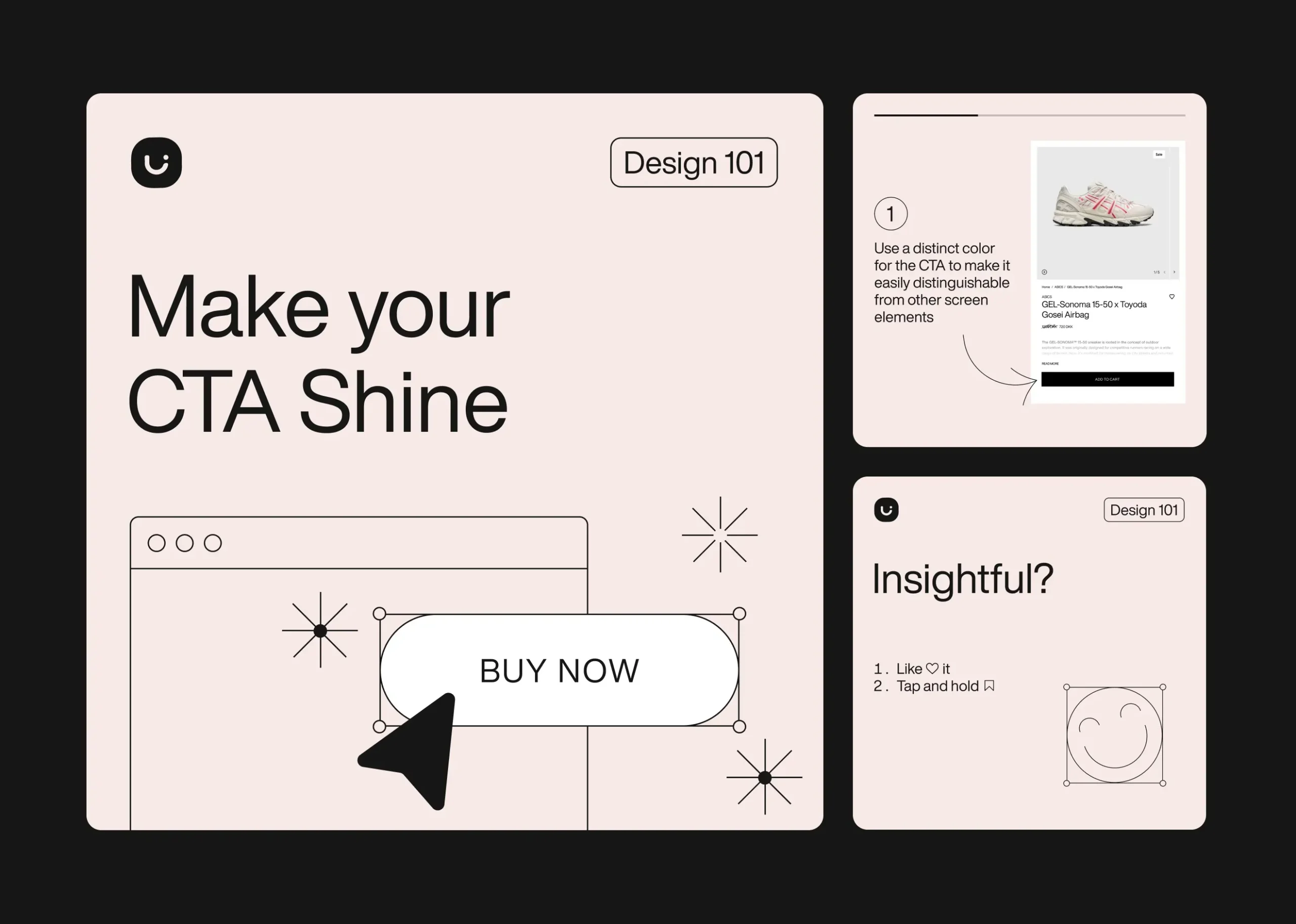
Part of the brief extended into social — a carousel format for Uizard’s design education content. The carousel had to work within the brand system while being optimised for the format: short, punchy, scannable slides that communicated a single idea clearly. The challenge was making educational content feel useful rather than generic, which came down to specificity — concrete tips, real examples, not design advice that could apply to anything.
Outcome
A redesigned landing page with a more considered visual language, dedicated AI feature sections with their own visual register, an expanded colour system, and a component library ready for implementation. The site now reflects where the product actually is rather than where it started.