Dublin Dance Festival — Poster Series
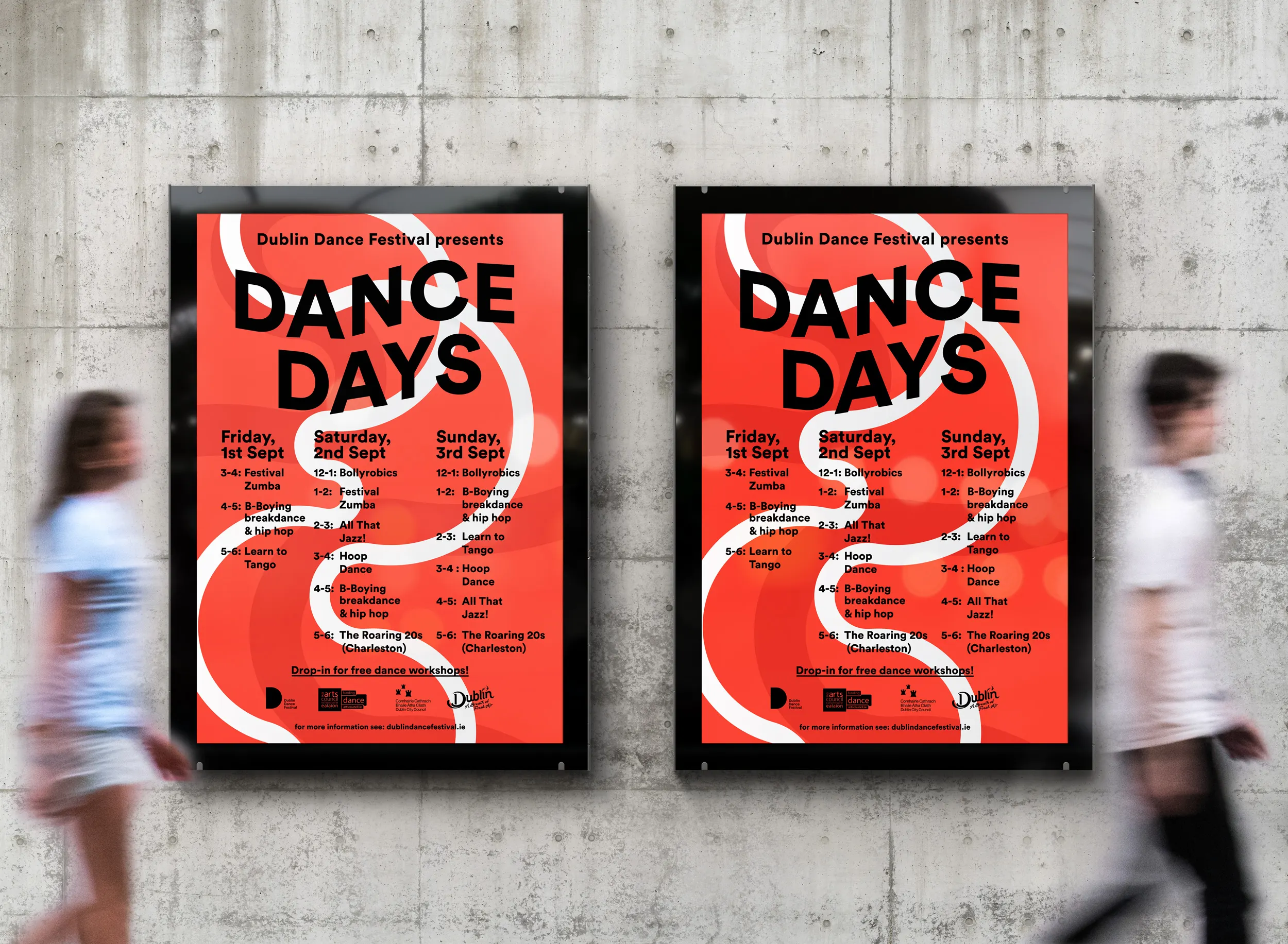
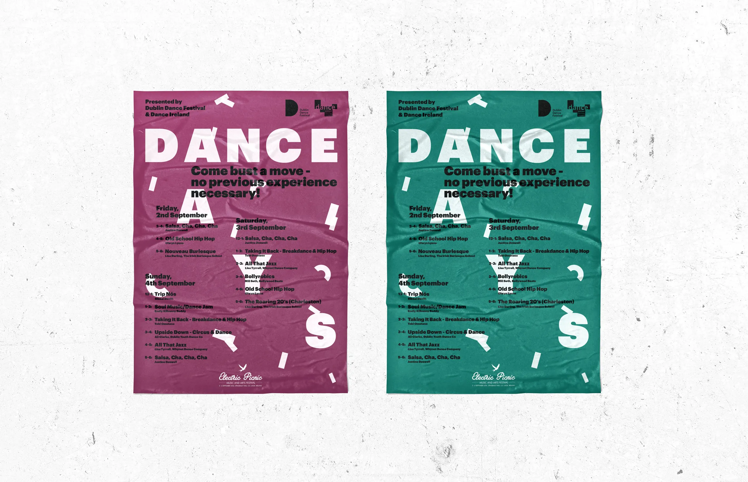
Poster series for Dance Days — a community programme running alongside Dublin Dance Festival — designed across two years, each treated as an independent visual experiment.
The brief
Dance Days sits outside the main festival programme. It is open, participatory, and aimed at people who might not otherwise walk through the door of a contemporary dance event. The posters needed to reflect that — accessible and direct without being bland, energetic without borrowing the more considered aesthetic of the headline festival. The brief gave a direction but left the visual language open, which made each year an opportunity to test something different rather than maintain a fixed system.
Visual approach
Both years were built around bold typography and high contrast, designed to work at street level and hold attention in a busy public environment. The programme schedule is a core part of the poster — there is a lot of practical information to carry — so the layouts had to make that content readable without killing the energy. The white swirling form that runs through the composition was something I developed specifically for the series, giving the poster movement and a sense of the body without using photography. It also softened what would otherwise be a very hard typographic grid.
Each year as an experiment
Rather than locking in a system after the first year, the approach was to push the visual language further each time — same core constraints, different solutions. The red is consistent, the scale of the type is consistent, but the way those elements are arranged and what sits alongside them shifts. The result is a series that reads as related without being repetitive, which reflects the spirit of the programme itself.